Workforce Retention Safety: Measure Perception Risk

Institutional building at dusk with most windows dark, showing unreported safety incident gap

Key Takeaways

  • Safety perception measurement gives CHROs a leading indicator that surfaces retention risk before it shows up in vacancy data
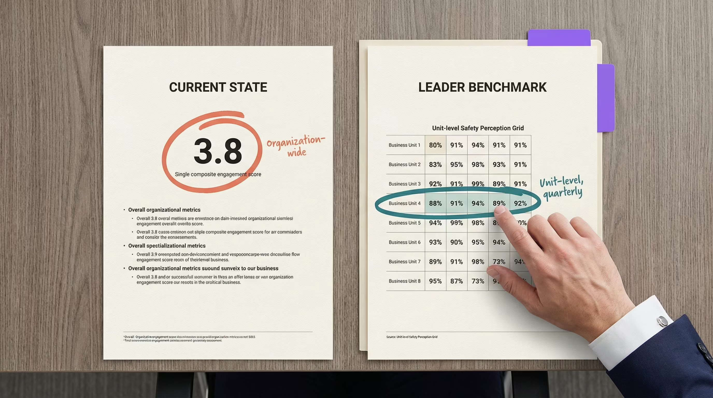
  • Validated survey instruments can establish a unit-level baseline in under 30 days, with quarterly tracking that connects directly to intent-to-stay
  • The delegation structure spans corporate HR, facility HR, quality, and clinical leadership, each owning a specific piece of the measurement-to-action workflow

Most facilities track turnover after staff leave. This guide shows you how to measure the safety perception that predicts departures months earlier, so you can intervene before vacancy data confirms what your nurses already decided.

You’ll walk away with a specific instrument selection, delegation structure, implementation timeline, and the connection between perception scores and the workforce retention safety metrics your CFO and board already track. For the research behind why perception predicts retention, see the complete guide to staff safety in psychiatric hospitals.

Before You Start: What You Need in Place

Building a perception measurement framework takes about 90 days to establish a baseline and first quarterly comparison. You need your current engagement survey data, exit interview summaries, incident reports, and turnover data broken out by unit.

Your team includes Quality/Compliance for survey method guidance, your CNO for clinical participation (the unit-level perception guide for nursing leaders covers the CNO’s piece of this), and your CSO for incident data.

If your exit interviews don’t currently include safety-specific questions, add two or three before moving forward: “Did safety concerns influence your decision to leave?” and “How would you rate our response to safety incidents?”

Even adding those two questions changes the data right away. The first round of responses tends to surface units no one flagged as high-risk.

How to Measure Workforce Retention Safety: Instrument Selection

Three validated instruments work for behavioral health settings. Each was developed in acute care and applies across inpatient environments.

InstrumentItemsTimeBest For
SAQ-SF (Safety Attitudes Questionnaire, Short Form)135-10 minutesRapid baseline, compressed timelines [1]
HSOPS 2.0 (AHRQ Hospital Survey on Patient Safety)4015-20 minutesFull annual assessment with national benchmarks [2]
AHRQ Workplace Safety Supplemental ItemsSupplementalAdd-onTargeting staff experience of organizational response [2]

Set a quarterly pulse cadence using the shorter instrument and an annual full assessment using HSOPS 2.0. Quarterly pulses capture directional trends between full assessments. The SAQ-SF works well for speed, but if your primary concern is whether staff trust the organization’s reaction to incidents, the HSOPS supplemental items are worth the extra time.

Here’s what the delegation looks like in practice:

TaskCorporate HRFacility HRQuality/Compliance
Instrument selectionDecidesProvides facility inputAdvises on regulatory alignment
Survey administrationSets cadenceExecutesValidates method
Data analysisAggregates system-wideReports unit-levelConnects to safety culture metrics
Action planningSets enterprise standardsDevelops unit-specific plansDocuments for accreditation

Compressed timeline: If you need a baseline in under 30 days, deploy the SAQ-SF to your single highest-turnover unit. Add two or three intent-to-stay questions. Establish the baseline now and refine instrument selection the following quarter.

One thing to keep in mind: pull your existing safety-related questions from your engagement survey and score them separately first. You may already have a rough baseline hiding in data you already collect. The gap between how important staff rate safety and how satisfied they feel with current systems is the number that predicts your next quarter’s retention.

Connecting Perception Scores to Retention Intent

The link between safety perception and turnover intent is well-established across multiple studies in acute care settings [1][3][4]. The practical question for your team isn’t whether the connection exists. It’s how to surface it in your own data.

Add one question to your safety perception surveys: “I would consider leaving this organization due to safety concerns” (strongly agree to strongly disagree). That single item transforms perception measurement from a culture exercise into a workforce planning tool with documented outcomes.

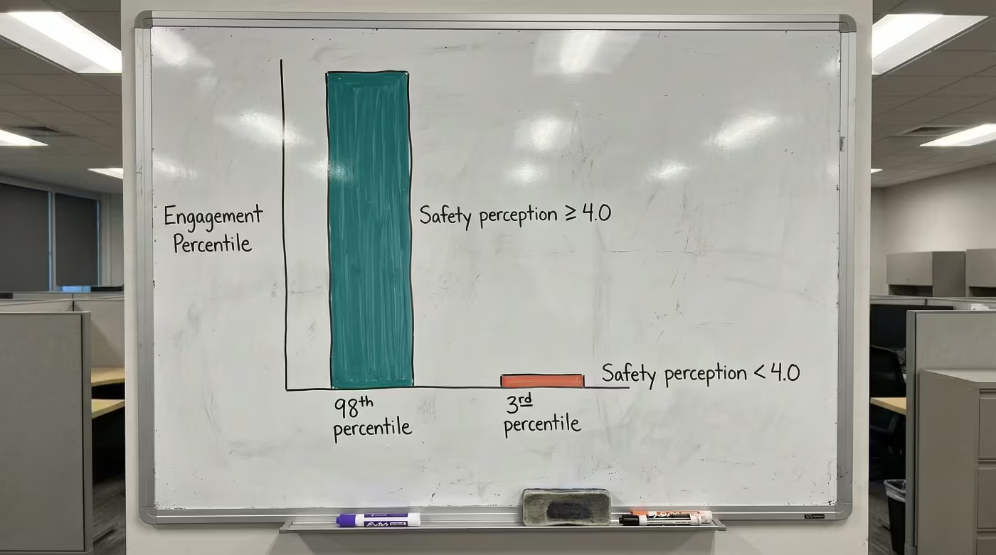
Then cross-reference. Which units show the largest gap between low perception scores and high stated intent to leave? That’s where your retention risk concentrates. Facilities that have made this connection recorded intent-to-leave dropping from 22% to 7% [5], though the timeline varied across sites. Facilities with pre-existing reporting cultures tended to move faster.

The connection also gives you a second lever. Perception influences job satisfaction, and job satisfaction independently predicts retention [4]. Improving perception directly and improving the conditions perception reflects both reduce turnover intent. Peer CHROs tracking this data describe it as the first time they could see retention risk forming instead of just counting departures after the fact.

Ready to build a perception measurement framework for your facility?

Contact Us

From Measurement to Action

Perception data without intervention is just measurement. What actually moves the needle is visible, repeated proof that safety is an operational priority. Here’s how the work divides across your leadership team:

Intervention ComponentCorporate HRFacility HRCNOCSO
Perception measurementOwns frameworkExecutes surveysSupports participationProvides incident data
Response systemApproves investmentCoordinates trainingOwns clinical workflowOwns response protocol
Visible follow-upSets standardsPuts into practiceEnsures staff see responseDocuments response times

Two questions predict whether your next perception survey will show improvement: When staff activate a call for help, how quickly does help arrive visibly? When staff report an incident, do they see documented follow-up? If the answer to either is “we don’t know,” that’s your starting point. The HR brief on safety perception metrics provides the specific data points to bring into those conversations with your CNO and CSO.

Your First 30 Days

Start with your single highest-turnover behavioral health unit. One unit, measured well, proves the model faster than a system-wide rollout.

  • Pull exit interview data from the past 12 months and flag every mention of safety, violence, or feeling unsupported
  • Identify your three highest-turnover units and cross-reference with whatever safety data exists (incident reports, workers’ comp claims, even anecdotal CNO input)
  • Deploy the SAQ-SF to one unit. Thirteen items, under 10 minutes. Add the intent-to-stay question.
  • Score the importance-satisfaction gap from any existing engagement data. If the gap exceeds 1.0 point, flag that unit for priority intervention planning.
  • Brief your CFO with one number: the annualized cost of turnover in your highest-risk unit. Each percentage point of nursing turnover costs roughly $289,000 annually [6]. For the full financial case and comparison data, the evidence shows what these numbers look like across different organizational models.

See how one behavioral health provider documented these results across their facilities.

Measurement alone doesn’t fix perception, but it gives you the language your CFO needs to approve the next step. With a safety perception baseline established, quarterly tracking in place, and correlation to retention intent on record, workforce retention safety becomes predictive. The next board conversation includes the leading indicator that explains why turnover moved before anyone submitted notice.

WORKFORCE MEASUREMENT

See Retention Risk Before It Hits Your Dashboard

Behavioral health facilities using perception measurement are catching turnover risk months earlier.

References

  1. PMC. Safety Attitudes and Turnover Intention. https://pmc.ncbi.nlm.nih.gov/articles/PMC10809511/
  2. AHRQ. Hospital Survey on Patient Safety Culture. https://www.ahrq.gov/sops/surveys/hospital/index.html
  3. PMC. Safety Culture and Newly Recruited Nurses. https://pmc.ncbi.nlm.nih.gov/articles/PMC9667691/
  4. Sigma Pubs. Safety Climate and Turnover Intention. https://sigmapubs.onlinelibrary.wiley.com/doi/10.1111/wvn.70073
  5. ROAR for Good. Internal data, 2024. Internal data
  6. NSI Nursing Solutions. 2025 NSI National Health Care Retention & RN Staffing Report. https://www.nsinursingsolutions.com/documents/library/nsi_national_health_care_retention_report.pdf

Nursing Safety Confidence: The Leading Indicator

Hospital staffing whiteboard with nurse names filled in and purple marker in tray

Key Takeaways

  • The anxiety CNOs carry into every staffing huddle comes from knowing that the metrics they rely on only confirm departures after the decision to leave was already made
  • Safety perception data gives you a leading indicator that arrives months before the resignation letter, turning reactive staffing into proactive retention
  • The shift from uncertainty to confidence starts with measuring what your nurses actually feel on each unit, not just what gets filed in incident reports

Two experienced nurses gave notice last week. Both exit interviews cited safety concerns. When you pulled the incident data, the numbers looked stable.

That’s the gap that keeps CNOs reacting instead of anticipating. Your incident reports, your engagement composites, your turnover dashboards: they all describe what already happened. None of them can tell you which unit is about to lose its next experienced nurse. Nursing safety confidence erodes in that space between what your data shows and what your nurses actually feel. For the full research behind why perception predicts retention, see the complete guide to staff safety in psychiatric hospitals.

The Anxiety: Always Reacting, Never Anticipating

Every CNO in behavioral health knows this version of the morning. You’re scanning which units are short, figuring out where float nurses need to go, and wondering whether the unit that just lost two staff will lose a third before you can backfill the first.

The pattern repeats because the data chain is broken. 81% of violence incidents go unreported [1]. Your charge nurses know things that never make it into a report. During rounding, a nurse mentions an incident from last night that she didn’t bother filing because nothing changed the last time she did. She’s telling you the measurement system can’t see what’s actually happening on her unit.

That creates a specific kind of uncertainty. You walk into every staffing huddle knowing that the numbers you’re working with describe last month’s reality. The perception shift that will drive next month’s vacancy happened on a shift you never heard about.

The peer CNOs who’ve moved past this gap describe the same starting point: the realization that every metric on their dashboard was a lagging indicator.

The Gap: What Your Dashboard Can’t Show You

Your turnover rate confirms departures. Your exit interviews explain them after the fact. Your incident reports capture a fraction of what happens. None of them measure the perception that drove the decision to leave.

The gap between what your data shows and what your staff experiences shows up during rounding. You review incident logs showing two or three events per quarter on a unit. Then you talk to nurses on that unit, and they describe near-daily confrontations. The nurse who says she “doesn’t feel safe anymore” isn’t describing a specific event. She’s describing a perception that formed over weeks of feeling unsupported.

What Your Staffing Data ShowsWhat Your Nurses Experience
Stable incident reportsMost incidents never filed
Acceptable engagement compositeUnit-level perception may be collapsing
Turnover rate (after departure)Perception shift that preceded it by months
Exit interview themes (“safety”)Specific moments where response felt inadequate

No one should face violence while trying to help others heal. And no staffing plan should be built on data that can’t see the departures forming.

Ready to see the signal your staffing dashboard has been missing?

Contact Us

The Shift: What Changes When You Can See It Coming

The confidence shift happens the first time you can pull unit-level perception scores and see which units are at risk before the resignation letter arrives. It happens when your charge nurses have specific talking points backed by measured data instead of general reassurance.

“Nursing safety confidence starts the moment you can see the signal your turnover dashboard has been missing.”

Facilities that built this measurement capability saw perception shifts within a single quarter [2]. That timeline matters for a CNO. It means you don’t need a multi-year transformation to start seeing results. You need one unit, one baseline, one 90-day measurement cycle. The unit-level perception guide covers exactly how to build that.

What this doesn’t fix: census spikes, acuity shifts, regional labor shortages. Perception data reveals the operational gaps driving departures, but closing them still requires unit-level action. The measurement is the starting point. But it’s the starting point that turns the conversation with your CHRO from “we need more staff” to “here’s why we’re losing the staff we have, and here’s where to intervene.” The CHRO measurement framework covers the corporate infrastructure needed to support what you build at the unit level.

One critical caution: measurement without visible follow-through backfires. When staff complete surveys and see no response, cynicism deepens rather than lifts [3]. The facilities that achieved results paired every measurement cycle with action staff could see.

See how one behavioral health provider documented these results across their facilities.

From Uncertainty to Confidence

Each percentage point of nursing turnover costs roughly $289,000 annually [4]. The full retention data shows what perception-driven improvements look like across facility types.

You know what tomorrow morning’s staffing huddle looks like. The same units short. The same scramble to cover. The same gap between what your data says and what your nurses feel.

But the CNO who measures safety perception at the unit level, tracking shifts quarterly and intervening before intent-to-leave becomes resignation, carries something different into that huddle: the confidence that comes from knowing which units need attention before the next name disappears from the schedule. Nursing safety confidence starts the moment you can see the signal your turnover dashboard has been missing.

NURSING CONFIDENCE

See Which Units Need Attention Before the Next Name Disappears

Safety perception measurement gives CNOs the leading indicator that turns reactive staffing into proactive retention.

References

  1. AHRQ PSNet. Addressing Workplace Violence and Creating a Safer Workplace. https://psnet.ahrq.gov/perspective/addressing-workplace-violence-and-creating-safer-workplace
  2. ROAR for Good. Internal data, 2024. Internal data
  3. PMC. Organizational Factors and Turnover Intention. https://pmc.ncbi.nlm.nih.gov/articles/PMC12258548/
  4. NSI Nursing Solutions. 2025 National Health Care Retention & RN Staffing Report. https://www.nsinursingsolutions.com/documents/library/nsi_national_health_care_retention_report.pdf

Staff Safety in Psychiatric Hospitals Comparison | 2026

psychiatric hospital safety perception self-assessment — printed five-row checklist with three empty checkboxes and purple pen across unchecked rows

Key Takeaways

  • The comparison matrix across six dimensions reveals where your facility sits between high-safety and low-safety profiles, with measurable gaps on every retention-relevant metric
  • Facilities in the middle of the spectrum tend to assume they’re performing adequately until they run the unit-level correlation between perception scores and turnover
  • A limitations table and evidence assessment checklist give you the framework to evaluate where your measurement infrastructure stands today

Units with the highest turnover are the same units where staff rate safety lowest. Exit interviews confirm it. The connection between safety perception and retention shows up in every workforce dashboard you pull, but most facilities lack a structured way to assess where they stand against peers. This staff safety in psychiatric hospitals comparison provides that framework across six measurable dimensions, along with the limitations of each approach and an assessment checklist for your next leadership review. For the full research behind the perception-retention connection, see the complete guide to staff safety in psychiatric hospitals.

The Comparison Matrix: High vs. Low Safety Perception Organizations

The following framework compares behavioral health settings across six dimensions that correlate with retention outcomes. Each dimension includes an assessment question you can answer with data you already have or can collect within 30 days.

DimensionHigh-Safety ProfileLow-Safety ProfileAssessment Question
Perception measurementUnit-level safety perception scored separately from engagement, tracked quarterlySafety questions buried in annual engagement compositeCan you produce unit-level safety perception scores right now?
Intent-to-stay connectionPerception scores correlated with intent-to-leave by unit; facilities have recorded drops from 22% to 7% [1]Safety perception and turnover tracked as separate metricsDo your perception scores connect to stated retention intent?
Reporting cultureIncidents treated as learning opportunities; visible follow-up on every reportStaff perceive that incidents are ignored after reporting [2]Do reporting staff see documented follow-up?
Response visibilityTimestamped response data verified by unit; staff see the system respond in real timeResponse times estimated or unknown; staff unsure whether calling for help will produce resultsCan you verify response times on your highest-acuity unit with timestamped data?
Preparedness76%+ of staff feel “very prepared” to respond to incidents [1]Fewer than 40% feel preparedWhat percentage of your staff report feeling very prepared?
Financial framingSafety presented as workforce planning investment with per-point ROI ($289,000 per turnover point [3])Safety positioned as a wellness benefit or compliance requirementCan you translate perception improvement into dollar savings for your CFO?

The gap between high and low profiles is substantial. Facilities sitting in the middle of this matrix tend to assume they’re performing adequately. The surprise usually comes when they run the unit-level correlation between perception scores and turnover. The CHRO measurement framework covers how to build that correlation, and peer CHROs already tracking this data describe it as the single most useful addition to their workforce dashboards.

Limitations of Each Approach

No measurement approach is perfect. The following table documents the limitations CHROs should account for when evaluating their position on the comparison matrix.

ApproachWhat It Captures WellWhat It MissesKey Limitation
Annual engagement survey with safety questionsFacility-level trends over timeUnit-level variation; quarterly perception shifts12-month lag means you see problems a year late
Quarterly safety-specific pulse surveysDirectional trends at the unit levelDeep root-cause understanding; nuance behind scoresRequires validated item selection; poorly designed pulses produce noisy data
Before-and-after perception measurementWhether specific interventions moved the needleLong-term sustainability; whether gains hold past 12 monthsA 38-point lift assumes a low starting baseline; mid-range facilities should expect smaller gains [1]
Intent-to-stay correlationLeading indicator of unit-level retention riskDoesn’t capture staff who leave without expressing intentRequires consistent measurement discipline; one-time snapshots aren’t predictive
Incident reportsDocumented events with timestamps81% of incidents that go unreported [4]; the perception that forms between reportsStable incident data often masks declining perception
Workers’ compensation claims dataFinancial impact of safety failuresPrevention value; perception-driven improvements before claims occurReductions of 20-50% are documented [1] but depend on baseline severity mix

Worth noting: the facilities that achieve leader-level outcomes don’t rely on any single approach. They layer quarterly pulses over annual assessments, connect perception to intent-to-stay, and verify response times with timestamped data. Each approach compensates for the blind spots in the others.

The Cost of the Gap

Each percentage point of nursing turnover costs roughly $289,000 annually [3]. For a behavioral health facility running 18% turnover, dropping to 15% represents roughly $867,000 in annual savings. 60% of nurses have changed or left their job due to workplace violence [5], making safety perception one of the most addressable drivers of that cost.

See how one behavioral health provider documented these results across their facilities.

The financial case becomes actionable when you can connect perception scores to intent-to-stay at the unit level. Without that connection, safety investment looks like a cost center. With it, safety investment becomes the workforce planning tool with documented outcomes that changes the CFO conversation.

Assessing Your Facility’s Position

Run through these priority areas before your next leadership review. If three or more reveal gaps, the measurement infrastructure to distinguish between a perception problem and a perception crisis likely isn’t in place.

Priority AreaWhat to EvaluateWhy It Matters
Unit-level measurementWhether safety perception is scored by unit, not just facilityThe facility average masks the units in crisis
Perception-retention correlationWhether perception scores connect to turnover data by unitWithout this, safety investment can’t be justified financially
Before-and-after trackingWhether perception change was measured around your last safety investmentNo before-and-after data means no business case for continued funding
Intent-to-stay trackingWhether intent-to-leave is tracked as a function of safety perceptionSeparates safety-driven attrition from general engagement trends
Reporting visibilityWhether staff who report incidents see documented follow-upUnits with the weakest reporting rates often have the lowest perception scores

The HR brief on safety perception metrics provides the specific data points to bring into each of these evaluation areas, and the full retention data shows what the before-and-after evidence looks like across facility types.

Safety perception is the leading indicator for retention. By the time turnover spikes, the perception problem has been building for months. This staff safety in psychiatric hospitals comparison shows that the gap between current performance and achievable performance is measurable across every dimension in the matrix, and it’s closable.

FACILITY COMPARISON

See Where Your Safety Perception Stands Against Peer Benchmarks

The comparison matrix shows measurable gaps across six retention-relevant dimensions. Find out where your facility falls.

References

  1. ROAR for Good. Internal data, 2024. Internal data
  2. National Nurses United. Workplace Violence Report. https://www.nationalnursesunited.org/sites/default/files/nnu/documents/0224_Workplace_Violence_Report.pdf
  3. NSI Nursing Solutions. 2025 NSI National Health Care Retention & RN Staffing Report. https://www.nsinursingsolutions.com/documents/library/nsi_national_health_care_retention_report.pdf
  4. AHRQ PSNet. Addressing Workplace Violence and Creating a Safer Workplace. https://psnet.ahrq.gov/perspective/addressing-workplace-violence-and-creating-safer-workplace
  5. ROAR for Good. An Analysis of Workplace Violence Statistics in Healthcare. https://www.roarforgood.com/blog/an-analysis-of-workplace-violence-statistics-in-healthcare/

Staff Safety in Psychiatric Hospitals Data: Retention

psychiatric hospital safety perception engagement gap — whiteboard two-bar chart showing 98th vs 3rd percentile cliff between high and low safety perception

Key Takeaways

  • This evidence brief compiles the peer-reviewed and recorded data connecting safety perception to retention, financial outcomes, and workforce stability in behavioral health
  • The evidence summary table consolidates every data point a CFO needs to evaluate safety perception as a retention lever
  • A verification checklist at the end shows whether your facility has the measurement infrastructure to build the business case

Exit interviews keep surfacing safety concerns. Your turnover dashboard keeps climbing. This staff safety in psychiatric hospitals data brief connects those two signals with the specific evidence your CFO needs: peer-reviewed correlation data, recorded before-and-after outcomes, and a financial translation that turns perception improvement into dollar savings. For the full framework behind why perception predicts retention, see the complete guide to staff safety in psychiatric hospitals.

The Perception-Retention Correlation

Safety culture predicts turnover intent with a strong negative correlation. Peer-reviewed research recorded a correlation of -0.883 between safety culture perception and nursing turnover intention [1]. Safety culture accounted for about 6.4% of turnover intent independently [1], which is notable given that it competes with compensation, scheduling, management quality, and commute time for the same outcome.

60% of nurses have changed or left their job due to workplace violence [2]. In behavioral health, where turnover exceeds the national nursing average by more than 6 percentage points [3], each departure costs more than the sector average because the replacement pool is smaller.

The engagement connection reinforces this. When safety perception scores reach 4.0 or above on a 5-point scale, engagement ranks at the highest levels nationally. When scores drop below that threshold, engagement collapses [4]. Safety perception drives engagement, and engagement drives retention. That chain is now documented at every link. The CHRO measurement framework covers how to surface this connection in your own data.

Recorded Before-and-After Outcomes

Facilities that established baselines, intervened, and re-measured recorded the following shifts [5]:

MetricBeforeAfterChange
Intent-to-leave due to safety concerns22%7%15-point reduction
“I feel safe at work” sentimentBaselineUp to 38-point liftMaximum recorded increase
Staff satisfaction with safety57%73%16-point gain in 3 months
Staff feeling “very prepared” for incidents38%76%38-point increase
Team members reporting increased confidence~80%

The 38-point lift represents the maximum recorded increase. Facilities with higher starting baselines should expect smaller gains over longer timelines. The 57% to 73% satisfaction shift happened within a single quarter, placing it at the fastest end of recorded timelines.

What these numbers share: every one was captured through before-and-after measurement. That measurement discipline is the step most facilities skip, and it’s the step that turns a wellness initiative into a workforce planning tool with documented outcomes.

Ready to build the evidence portfolio for your next budget conversation?

Contact Us

The Financial Case

CategoryMetricValue
Cost of turnoverPer-RN replacement cost$61,110-$88,000 [3]
Cost of turnoverPer-percentage-point turnover cost$289,000/year [3]
Cost of turnoverBH setting (200 nurses, 22% turnover)~$6.4M annually
Value of interventionIntent-to-leave reduction15 percentage points [5]
Value of interventionWorkers’ comp claims reduction24-50% [5]
Value of interventionTimeline to measurable change3-9 months [6]

For a behavioral health facility running 18% turnover, dropping to 15% represents roughly $867,000 in annual savings. The workers’ comp reductions (24-50%) depend on baseline severity; the higher end came from facilities with the most severe incident rates. The full comparison across organizational models shows how these numbers scale by facility size.

See how one behavioral health provider documented these results across their facilities.

The Evidence Summary

The evidence chain below consolidates what a CFO needs to evaluate safety perception as a retention lever.

ClaimEvidenceSource
Safety perception predicts turnoverCorrelation of -0.883 (p = .006)Peer-reviewed [1]
Perception drives engagementDramatic gap between high and low perception scores on engagementPress Ganey / AHRQ [4]
Perception improvement is measurableUp to 38-point sentiment increaseRecorded deployments [5]
Perception change reduces intent-to-leave22% to 7%Recorded deployments [5]
Each turnover point has financial value$289,000/yearNSI 2025 Report [3]
BH is the highest-ROI settingHighest turnover + highest violence rates in healthcareNSI [3], Sheps Center [7]

Behavioral health’s combination of high turnover and high violence rates makes it the setting where safety perception improvement yields the greatest per-dollar retention return. Even a fraction of the documented shifts, in a setting where each turnover point costs $289,000, changes the math. Peer CHROs building this data into their workforce dashboards describe it as the business case that finally moved the budget conversation.

Evidence Portfolio Checklist

Before your next budget conversation, verify whether you can produce answers to these:

Verification QuestionWhy It Matters
Can you produce a dated baseline for “I feel safe at work” scores across behavioral health units?Without a baseline, no improvement is provable
Do exit interviews specifically ask about safety perception (not just “workplace concerns”)?Vague questions produce vague data
Are you tracking incidents filed versus incidents witnessed?Reported data alone understates the problem (81% unreported [4])
Does workers’ comp data connect to specific units and shifts?Facility-level totals hide the highest-risk areas
Can you show a 3-month and 9-month trendline on safety perception scores?Trendlines prove sustained change, not one-time bumps

The HR brief on safety perception metrics provides the specific data points to bring into each of these verification areas.

The staff safety in psychiatric hospitals data is clear: perception predicts turnover intent, perception improvement produces recorded retention shifts, and each turnover point saved returns $289,000 annually. The evidence exists to transform exit interview patterns into a quantified business case.

EVIDENCE PORTFOLIO

Build the Business Case Your CFO Needs

The peer-reviewed and recorded data connecting safety perception to retention exists. See what it looks like for your facility.

References

  1. PMC. Patient Safety Culture, Resilience, and Turnover Intention Among Nurses. https://pmc.ncbi.nlm.nih.gov/articles/PMC12896111/
  2. National Nurses United. Workplace Violence Report. https://www.nationalnursesunited.org/press/nnu-report-shows-increased-rates-of-workplace-violence-experienced-by-nurses
  3. NSI Nursing Solutions. 2025 National Health Care Retention & RN Staffing Report. https://www.nsinursingsolutions.com/documents/library/nsi_national_health_care_retention_report.pdf
  4. AHRQ PSNet. Ensuring Patient and Workforce Safety. https://psnet.ahrq.gov/perspective/ensuring-patient-and-workforce-safety-culture-healthcare
  5. ROAR for Good. Internal data, 2024. Internal data
  6. Dove Press. Workplace Violence Prevention in Healthcare. https://www.dovepress.com/article/download/80739
  7. Sheps Center. Trends in Workplace Violence, 2025. https://www.shepscenter.unc.edu/wp-content/uploads/2025/01/Y10.01_Brief-1.pdf

Peer CHRO Safety Insights: Retention Benchmarks

CHRO safety perception benchmark — two printed summaries showing composite lagging score vs unit-level leader benchmark side by side

Key Takeaways

  • Leading CHROs measure safety perception at the unit level quarterly, while most programs still rely on annual engagement composites that mask the units in crisis
  • The gap between leaders and most programs comes down to whether perception data is connected to intent-to-stay, turning it from a culture metric into a workforce planning tool
  • Peer organizations that acted on perception data saw measurable retention improvements within 90 days of establishing baselines

Every CHRO in behavioral health knows safety concerns drive turnover. The difference between the CHROs who keep losing staff and those who’ve stabilized their hardest units isn’t awareness of the problem. It’s what they measure and when they measure it.

This piece shows what peer CHRO safety insights reveal about how leading behavioral health organizations track safety perception differently, and where most programs fall short. For the full research behind why perception predicts retention, see the complete guide to staff safety in psychiatric hospitals.

What Peer CHRO Safety Insights Reveal About Measurement

The operational gap between leading programs and most behavioral health HR operations shows up across four dimensions. In each case, the difference isn’t budget or technology. It’s measurement precision and speed.

Measurement level: unit vs. composite. Most CHROs review safety perception as part of a facility-wide engagement score. Leaders pull safety-specific items and score them by unit. The difference matters because a facility might report 72% positive safety perception overall while one behavioral health unit sits at 41%. That unit is a retention emergency, invisible in the composite. How to build this measurement framework covers the specific instruments and delegation structure.

Measurement frequency: quarterly vs. annual. Most programs measure safety culture once a year through their engagement survey. Leaders run quarterly pulses on safety perception specifically, capturing directional trends that predict retention shifts 90 days out. Annual measurement can only confirm what already happened. Quarterly measurement surfaces what’s about to happen.

Data connection: standalone vs. correlated. Most programs treat safety perception as a standalone culture metric. Leaders connect perception scores to intent-to-stay data at the unit level, which turns safety perception into a workforce planning tool their CFO can act on. The facilities that made this connection recorded intent-to-leave dropping from 22% to 7% [1].

Onboarding attention: ignored vs. tracked. Most programs wait for the annual survey to capture new hires’ safety perception. Leaders measure perception during the first 90 days of onboarding, because a new nurse’s sense of whether the organization takes safety seriously forms fast and is remarkably durable once set. The CHROs ahead of the curve treat that onboarding window as the highest-leverage moment for perception formation.

Where Leaders and Most Programs Compare

DimensionMost ProgramsLeading Programs
Measurement levelFacility-wide or organization-wide compositeUnit-level, scored separately from engagement
Measurement frequencyAnnual (buried in engagement survey)Quarterly safety-specific pulse + annual full assessment
Retention connectionSafety perception and turnover tracked separatelyPerception scores correlated with intent-to-stay by unit
Onboarding perceptionFirst captured at annual surveyMeasured within first 90 days
Action on dataSurvey results reviewed and filedUnit-level declines trigger CSO coordination and charge nurse coaching
Financial framingSafety positioned as a wellness benefitSafety framed as workforce planning investment with per-point ROI

The financial framing matters for the CFO conversation. Each percentage point of nursing turnover costs roughly $289,000 annually [2]. Leaders don’t present safety perception as a culture initiative. They present it as the leading indicator that explains why their next quarter’s turnover moved, with the full retention data to back it up.

“The CHROs pulling ahead aren’t measuring turnover more carefully. They’re measuring something upstream: the safety perception shift that predicts turnover months before a resignation letter arrives.”

Ready to see where your program stands against peer benchmarks?

Contact Us

Assessing Where Your Program Stands

Run through this self-check against the leader benchmarks above. Be honest about where your program sits today.

  • Can you pull unit-level safety perception scores right now, or would you have to dig through a composite engagement survey?
  • Do your safety perception scores connect to intent-to-stay data, or are they standalone metrics?
  • When was the last time a unit-level perception decline triggered a specific intervention (not a policy review, but a visible action staff could see)?
  • Do new hires on behavioral health units get a safety perception check within their first 90 days, or do they wait for the annual survey?
  • Can you tell your CFO the annualized cost of turnover on your highest-risk unit in a single number?

If more than two answers point to the “most programs” column, that’s the gap. The HR brief on safety perception metrics provides the specific data points to start closing it.

One finding worth flagging: facilities that run safety culture surveys without visibly acting on results see declining response rates and worsening scores [3]. Measurement without visible follow-through is counterproductive. The programs achieving leader-level results pair measurement with action staff can see. Peer CNOs tracking unit-level data describe the same pattern from the clinical side.

Pull your safety-specific items from your engagement survey and score them by unit. That single step, done this week, tells you whether you’re operating as a leader or running the same measurement approach as everyone else. The CHROs who stabilized their behavioral health units started with that one data pull. Within 90 days, they had the peer CHRO safety insights that changed the retention conversation entirely.

PEER BENCHMARKS

See How Your Safety Perception Program Compares

Leading behavioral health CHROs are using perception measurement as a workforce planning tool. Find out where your program stands.

References

  1. ROAR for Good. Internal data, 2024. Internal data
  2. NSI Nursing Solutions. 2025 NSI National Health Care Retention & RN Staffing Report. https://www.nsinursingsolutions.com/documents/library/nsi_national_health_care_retention_report.pdf
  3. AHRQ PSNet. Culture of Safety. https://psnet.ahrq.gov/primer/culture-safety

Staff Safety in Psychiatric Hospitals: Complete Guide

psychiatric hospital staff safety CHRO — conference table contrasting thick lagging workforce reports with single safety perception baseline sheet

Key Takeaways

  • Safety perception is a measurable leading indicator that predicts which staff will leave months before resignation letters arrive
  • The gap between how important staff rate safety and how satisfied they feel with current systems reveals the retention risk most dashboards miss
  • Facilities that track perception shifts and respond visibly can move the needle on turnover before it shows up in quarterly reports

Your vacancy dashboard shows behavioral health nursing turnover at 22.8%, the highest of any specialty in your system [1]. Exit interviews keep surfacing “safety concerns” as a contributing factor. But when you cross-reference incident reports, the numbers look stable.

That gap between what exit interviews say and what incident data shows is a measurement problem, not a staffing mystery. You’re tracking the aftermath of decisions your staff made months ago. The perception that drove those decisions never appeared on any report you reviewed. Understanding staff safety in psychiatric hospitals means measuring what staff actually feel, not just what gets reported.

The Safety Perception Gap: What Staff Feel vs. What Facilities Measure

The workforce metrics on your dashboard (turnover rate, time-to-fill, cost-per-hire, engagement composite score) are all reliable. They’re also all retrospective. By the time a departure appears in your data, the perception shift that caused it happened weeks or months earlier.

The gap starts with what actually gets captured. 81% of workplace violence incidents go unreported by healthcare workers who experienced them [2]. Your incident data isn’t quiet because violence is rare. It’s quiet because staff have stopped reporting.

The reasons are consistent: normalization, perceived futility, fear of retaliation [3]. Nurses on acute psychiatric units often treat physical aggression as part of the job. Nearly half of nurses say incidents are simply ignored after being reported, and fewer than a third say their employer provides a clear way to report them at all [4]. Staff learned that reporting changes nothing, so they stopped. Your incident data looks stable while your turnover accelerates.

None of your standard systems catch this. Incident reports understate reality. Your engagement survey buries safety questions in a 50-item instrument analyzed once a year. Exit interviews capture themes but not timing.

MetricWhat It CapturesWhen You See ItWhat It Misses
Turnover rateDepartures after they happen30-90 days post-decisionThe perception shift that preceded the decision by months
Exit interviewsStated reasons for leavingAt resignationStaff who stay but disengage; incidents never reported
Incident reportsRecorded eventsAfter filing81% of incidents that go unreported
Engagement surveyAnnual composite scoreOnce per yearQuarterly or monthly perception changes on specific units
Safety perception baselineHow staff feel about organizational safety responseIn real timeNothing, if you measure it

The bottom row of that table is where the opportunity lives.

How Staff Safety in Psychiatric Hospitals Predicts Who Stays

60% of nurses have changed or left their job, or considered leaving, due to workplace violence [5]. In behavioral health, where violence exposure rates exceed general healthcare settings, that percentage translates to workforce instability that compounds with every departure.

But here’s what the research keeps confirming: the incident itself doesn’t determine whether someone stays or leaves. Their perception of how the organization responded does [6]. Staff who felt supported and heard after incidents showed far lower intent to leave than staff who felt ignored, even when the incidents were similar in severity [7].

“The incident itself doesn’t determine whether someone stays or leaves. Their perception of how the organization responded does.”

That reframes the retention problem entirely. It shifts from “reduce violence” (difficult, partially outside your control) to “prove organizational commitment to safety” (achievable, directly within your control). A visible, fast response to an incident on the unit can do more for retention than a prevention program staff never see in action.

No one should face violence while trying to help others heal.

The pathway from perception to departure runs through burnout. Staff in organizations where leadership doesn’t prioritize safety are far more likely to burn out [8]. And burnout is the most common precursor to turnover intent [9]. When the workplace itself feels unsafe, dissatisfaction turns into a decision to leave.

Facilities using ongoing perception measurement have recorded retention shifts within 90 days [10]. The signal only becomes useful with repeated data points at the unit level, but it confirms what decades of research now show: safety perception predicts retention intent through well-documented pathways. If you can measure perception, you can see the turnover coming. And if you can see it, you can intervene.

Measuring Perception: The Leading Indicator Your Dashboard Is Missing

Your employee engagement survey likely includes safety-related questions already. The real issue is how that data is structured and used.

When safety questions are blended into a composite score and analyzed once a year, they can’t work as a leading indicator. Leading indicators need frequency, specificity, and actionability. Validated instruments like the Psychosocial Safety Climate Scale and AHRQ’s Surveys on Patient Safety Culture give you the measurement framework. For a detailed implementation guide, see how to measure safety perception as a retention predictor.

“If you can measure perception, you can see the turnover coming. And if you can see it, you can intervene.”

Measurement ApproachFrequencySpecificityActionabilityLeading Indicator Value
Annual engagement survey (composite)Once per yearLow (blended score)Low (no unit-level detail)Minimal
Quarterly safety perception pulseEvery 90 daysModerate (safety-specific)Moderate (trend visible)Moderate
Ongoing perception tracking with unit-level dataOngoingHigh (unit, shift, role)High (targeted intervention)High

The CHRO who treats safety perception as a leading indicator pulls safety-specific questions from the broader engagement instrument, establishes a unit-level baseline, and tracks changes at least quarterly. When perception drops on a specific unit, they investigate before the turnover spike shows up in next quarter’s dashboard.

The benchmark that matters most is your own trajectory: are perception scores improving, stable, or declining? That directional signal predicts your next quarter’s retention. Safety perception is a core driver of engagement, not separate from it [11]. When safety perception drops, engagement follows. When engagement drops, turnover follows.

What Moves Perception and What Doesn’t

Understanding that perception predicts retention creates an obvious question: what actually changes perception? The research identifies three categories, and they compound when combined.

Visible organizational responsiveness. When staff activate a call for help and help arrives fast, that single experience reshapes how they see the organization’s commitment. When they report an incident and see documented follow-up, the perception of futility breaks [12]. What matters is staff seeing the system respond when they need it, not having the right policy on paper. Peer CHROs are already building this kind of tracking into their safety programs.

Multi-component programs over single-session training. Training alone doesn’t shift perception because it addresses individual capability, not organizational response. Multi-component programs that combine training with visible systems and documented follow-through show larger and more sustained improvements [13]. Perception shifts when staff see the system respond, not when they learn a technique in a classroom.

Supervisor communication. Managers who receive coaching on communicating safety as a priority see measurable improvement in how their teams perceive safety culture [14]. This is your highest-leverage mechanism because it’s directly within HR’s control. Whether charge nurses communicate safety commitment at every shift handoff is a coaching decision your CNO can make this week. CNOs tracking unit-level perception data are already using this approach to stabilize staffing.

Facilities putting these approaches into practice have recorded up to a 38-point lift in “I feel safe at work” survey responses within months [10]. For the full evidence set behind these outcomes, the numbers show what happens when perception becomes an operational priority rather than an annual survey question.

Want to understand what measuring safety perception looks like at your facility?

Contact Us

From Perception Shift to Retention Impact

Before implementing perception measurement and intervention at one behavioral health facility, 22% of staff said they’d consider leaving due to safety concerns. After: 7% [10]. That shift was captured before any resignations occurred.

See how one behavioral health provider documented these results across their facilities.

The financial translation is direct. Each 1% reduction in nursing turnover saves roughly $289,000 annually [1]. For a behavioral health system running at 22.8% nursing turnover, even modest perception-driven retention improvements generate substantial returns.

ScenarioTurnover ReductionAnnual Savings (per $289K/point)Nurses Retained (per $61,110 each)
1-point reduction (22.8% to 21.8%)1 percentage point$289,000~5 nurses
3-point reduction (22.8% to 19.8%)3 percentage points$867,000~14 nurses
5-point reduction (22.8% to 17.8%)5 percentage points$1,445,000~24 nurses

Worth noting: $289,000 is a national average across nursing specialties. Behavioral health replacement costs typically run higher due to smaller candidate pools and longer onboarding. Your actual per-nurse cost likely exceeds this benchmark.

The cost savings extend beyond direct replacement. Facilities with documented safety programs also report reductions in workers’ compensation claims and post-incident costs [15]. The full financial breakdown and comparison data shows how perception-driven safety investment compares across organizational models.

Building a Safety Perception Strategy for Your Facility

Leading healthcare systems are integrating safety perception into the same workforce planning frameworks they use for engagement, compensation, and career development [16]. Building this capability takes four elements.

Establish a baseline. Pull safety-specific questions from your existing engagement survey and score them separately by unit. Your overall score may look acceptable while specific units are in crisis. The pattern is remarkably consistent: the organization-wide average masks one or two units where perception has already collapsed and turnover is about to follow.

Track changes with frequency. Annual measurement can’t work as a leading indicator. Quarterly pulse surveys on safety perception give you the trend data that predicts retention shifts. When perception drops on a specific unit between quarters, you have a 90-day window to intervene before turnover shows up. CNOs using perception data for unit staffing decisions describe this as the shift from reactive to proactive workforce management.

Correlate with retention intent. Add intent-to-stay questions to your safety perception surveys. The connection between perception scores and intent-to-leave is what turns safety perception from a “soft” metric into a workforce planning tool with documented outcomes.

Intervene where perception drops. Perception data without intervention is just measurement. When a unit shows declining scores, work with your CSO to evaluate response protocols and your CNO to assess whether staff are experiencing unreported incidents. The HR brief on safety perception metrics provides the specific data points to bring into those conversations.

Here’s a practical starting point for the next 90 days:

  • Pull safety-specific items from your current engagement survey and score them separately by unit. Can you identify which units fall below the organizational average?
  • Add two to three intent-to-stay questions to your next pulse survey, tied directly to safety perception
  • Review your incident reporting workflow. Does your system close the loop visibly enough that the reporting nurse sees what happened after they filed?
  • Ask your CNO whether charge nurses on behavioral health units have explicit language for communicating safety commitment at shift handoff
  • Identify your single highest-turnover behavioral health unit and run a focused safety perception baseline there first. One unit, measured well, proves the model faster than a system-wide rollout.

Your turnover dashboard will still show 22.8% tomorrow morning. The exit interviews will still cite safety concerns. But the CHRO who treats safety perception as a leading indicator, measuring baselines, tracking shifts, intervening before intent-to-leave becomes resignation, gains something lagging metrics can’t provide: the ability to see who’s considering leaving before the resignation letter arrives. The research connecting staff safety in psychiatric hospitals to retention is clear. The measurement tools are validated. The question is whether your team will keep measuring departures after they happen, or start measuring the perceptions that predict them.

WORKFORCE STRATEGY

Turn Safety Perception Into a Retention Lever

See how behavioral health facilities are using perception measurement to predict and prevent turnover.

References

  1. NSI Nursing Solutions. 2025 NSI National Health Care Retention & RN Staffing Report. https://www.nsinursingsolutions.com/documents/library/nsi_national_health_care_retention_report.pdf
  2. AHRQ PSNet. Addressing Workplace Violence and Creating a Safer Workplace. https://psnet.ahrq.gov/perspective/addressing-workplace-violence-and-creating-safer-workplace
  3. American Nurses Association. Unreported Workplace Violence: Why Is This So Common? https://www.nursingworld.org/content-hub/resources/workplace/unreported-workplace-violence—why-is-this-so-common/
  4. National Nurses United. Workplace Violence Report. https://www.nationalnursesunited.org/sites/default/files/nnu/documents/0224_Workplace_Violence_Report.pdf
  5. ROAR for Good. An Analysis of Workplace Violence Statistics in Healthcare. https://www.roarforgood.com/blog/an-analysis-of-workplace-violence-statistics-in-healthcare/
  6. PMC. Workplace Violence and Turnover Intention. https://pmc.ncbi.nlm.nih.gov/articles/PMC12811911/
  7. PMC. Organizational Support and Turnover Intention. https://pmc.ncbi.nlm.nih.gov/articles/PMC7750754/
  8. CDC MMWR. Vital Signs: Health Worker-Perceived Working Conditions and Symptoms of Poor Mental Health. https://www.cdc.gov/mmwr/volumes/72/wr/mm7244e1.htm
  9. PMC. Burnout and Turnover Intention in Healthcare. https://pmc.ncbi.nlm.nih.gov/articles/PMC11496712/
  10. ROAR for Good. Internal data, 2024. Internal data
  11. Press Ganey. Supporting Patient Safety Culture in Healthcare Requires Higher Employee Engagement. https://www.pressganey.com/resources/blog/supporting-patient-safety-culture-in-healthcare-requires-higher-employee-engagement/
  12. PMC. Transparent Reporting Systems and Perception Change. https://pmc.ncbi.nlm.nih.gov/articles/PMC11980070/
  13. PMC. Multi-Component Violence Prevention Programs. https://pmc.ncbi.nlm.nih.gov/articles/PMC12542813/
  14. PMC. Manager Safety Communication and Subordinate Perceptions. https://pmc.ncbi.nlm.nih.gov/articles/PMC9742354/
  15. American Hospital Association. Costs of Violence. https://www.aha.org/costsofviolence
  16. PMC. Safety and Psychological Well-Being in Retention Programs. https://pmc.ncbi.nlm.nih.gov/articles/PMC10341299/

Peer CNO Safety Insights: Unit-Level Metrics

Peer CNO safety insights: executive in glass office unable to hear distressed nurses in hallway

Key Takeaways

  • Leading CNOs measure safety perception at the unit level quarterly, while most programs rely on facility-wide composites that hide the units in crisis
  • The peer gap shows up in four dimensions: measurement level, frequency, retention connection, and whether charge nurses receive explicit safety communication coaching
  • Self-assessment against peer benchmarks reveals whether your units are operating with leading indicators or reacting to turnover after it happens

The CNOs retaining behavioral health nurses while peers lose them at 22.8% annually aren’t working with different staff or lower-acuity patients. They’re working with different data. Specifically, they’re measuring something at the unit level that most programs only capture in annual facility-wide composites, if they capture it at all.

This piece shows what peer CNO safety insights reveal about how leading programs track perception differently from the clinical side. For the full research behind why perception predicts retention, see the complete guide to staff safety in psychiatric hospitals.

What Peer CNO Safety Insights Reveal About Unit-Level Measurement

The gap between leading CNOs and most behavioral health nursing programs shows up across four dimensions. In each case, the difference is operational, not budgetary.

Measurement level: unit vs. facility. Most CNOs receive safety perception data as a facility-wide composite from their annual engagement survey. Leaders score safety-specific items by unit. The difference matters because a facility might report acceptable safety perception overall while one behavioral health unit has collapsed. That unit is a staffing emergency you can’t see in the composite. The unit-level perception guide covers how to build this measurement step by step.

Measurement frequency: quarterly vs. annual. Most programs measure safety culture once a year. Leaders run quarterly pulses on their behavioral health units specifically, using short validated instruments that take under 10 minutes per nurse. Annual measurement can only confirm what already happened. Quarterly measurement surfaces what’s about to happen, giving you a 90-day window to intervene before turnover shows up.

Charge nurse coaching: explicit vs. assumed. Most programs expect charge nurses to communicate safety commitment without specific language or coaching. Leaders provide explicit talking points for shift handoff, post-incident follow-up, and rounding. Leadership quality accounts for about 34% of the variation in whether nurses stay or leave [1], and charge nurses are the frontline of that leadership on every shift. CNOs using perception data for staffing decisions describe charge nurse coaching as the intervention with the shortest distance between action and measurable perception shift.

Response visibility: documented vs. uncertain. Most programs can’t tell you how quickly help arrives when staff call for it on a specific unit, or whether the reporting nurse sees documented follow-up. Leaders work with their CSO to verify timestamped response data and ensure follow-up is visible. When 81% of violence incidents go unreported [2], the reason is usually that staff decided reporting changes nothing. Visible follow-up breaks that cycle. The nursing safety brief on perception data provides the specific talking points for that CSO conversation.

Where Leading CNOs and Most Programs Compare

DimensionMost ProgramsLeading Programs
Measurement levelFacility-wide composite from engagement surveyUnit-level safety perception scored separately
Measurement frequencyAnnualQuarterly safety-specific pulse + annual full assessment
Charge nurse coachingGeneral expectation to “communicate safety”Explicit language for shift handoff, post-incident, and rounding
Response time verificationRelies on estimates or anecdotal reportsTimestamped data verified with CSO by unit
Retention connectionSafety perception and turnover tracked separatelyPerception scores correlated with intent-to-stay by unit
Action on declining scoresReviewed at next annual planning cycleUnit-level declines trigger immediate investigation and intervention

Facilities that have made the connection between perception and retention recorded intent-to-leave dropping from 22% to 7% [3]. The full evidence set behind these outcomes shows what happens when perception becomes an operational priority at the unit level.

“The CNOs retaining behavioral health nurses while peers lose them aren’t working with different staff or lower-acuity patients. They’re working with different data.”

Want to see what unit-level perception measurement looks like in practice?

Contact Us

Assessing Where Your Units Stand

Run through this self-check against the peer benchmarks above.

  • Can you produce unit-level safety perception scores for each behavioral health unit, or only a facility composite?
  • When was the last time a perception decline on a specific unit triggered a visible intervention your staff could see?
  • Do your charge nurses have explicit safety commitment language for shift handoff, or is communication left to individual discretion?
  • Can you verify actual response times on your highest-acuity unit with timestamped data from your CSO?
  • Do your nurses know what changed as a result of the last safety survey they completed?

If more than two answers point to the “most programs” column, that’s the gap. The CHRO measurement framework covers the corporate infrastructure needed to support what you build at the unit level.

One pattern worth flagging: facilities that run safety surveys without visibly acting on results see declining response rates and worsening scores [2]. Measurement without visible follow-through teaches staff that surveys are performative. The programs achieving leader-level results pair every measurement cycle with action staff can see.

See how one behavioral health provider documented these results across their facilities.

The charge nurse who says “it wasn’t that bad” during rounding isn’t describing the incident. She’s describing her expectation that reporting won’t change anything. The CNOs closing that gap are the ones retaining nurses others lose. Start with one unit, one validated pulse survey, and one 90-day measurement cycle. That’s how the peer CNO safety insights separating top programs from the 22.8% average begin.

PEER BENCHMARKS

See How Your Unit-Level Safety Data Compares

Leading behavioral health CNOs are using perception measurement to retain nurses others lose.

References

  1. PMC. Leadership Quality and Nurse Retention. https://pmc.ncbi.nlm.nih.gov/articles/PMC10806563/
  2. AHRQ PSNet. Culture of Safety. https://psnet.ahrq.gov/primer/culture-safety
  3. ROAR for Good. Internal data, 2024. Internal data

11 Staff Safety Perception and Retention Questions Answered

Staff safety in psychiatric hospitals FAQ — split waiting room with occupied vs abandoned chairs

Psychiatric hospitals face a workforce challenge that standard dashboards miss. Staff who feel unsafe start looking for other jobs months before they resign, and most facilities only measure safety after someone has already left. These frequently asked questions about staff safety in psychiatric hospitals cover what the data shows, how to measure it, and what leaders can do to turn safety perception into a retention strategy.

Why does staff safety perception matter more than incident reports for predicting turnover?

Safety perception captures how staff actually feel on the unit every day. Incident reports miss most of what happens – 81% of workplace violence incidents go unreported. That means facilities relying on incident data alone are building staffing plans on incomplete information. Staff who feel unsafe start job searching quietly, and their resignation arrives months after the perception problem began.

What is the connection between staff safety in psychiatric hospitals and nurse retention?

Feeling safe at work is one of the strongest predictors of whether nurses stay. Peer-reviewed research found a -0.883 correlation between safety culture perception and turnover intention. In practical terms, that means the lower a nurse rates safety, the more likely she is to leave. Behavioral health settings face the steepest risk because they combine high violence rates with turnover that already runs well above the national average.

How much does nursing turnover actually cost in behavioral health settings?

Each percentage point of nursing turnover costs roughly $289,000 per year. That figure includes recruitment, onboarding, agency staffing, and lost productivity. Even a small improvement in retention – say three points – saves nearly $870,000 annually. When the root cause is safety perception, the investment to move the number is far less than the cost of continuing to replace staff.

Why do engagement surveys miss the safety problems driving turnover?

Most engagement surveys measure safety as one item buried in a facility-wide composite score. That composite hides unit-level problems entirely. A behavioral health unit scoring 40% on safety can be averaged into a facility score that looks acceptable. Leading programs break scores out by unit and measure quarterly instead of annually. Annual measurement can only confirm what already happened.

What should CHROs measure instead of standard turnover metrics?

Start with unit-level safety perception scores tied to a single intent-to-stay question. This combination reveals where retention risk is concentrating before resignations arrive. Validated instruments like the SAQ-SF can produce a usable baseline in 30 days on your highest-turnover unit. The gap between how important staff rate safety and how satisfied they feel with current systems is the number that predicts next quarter’s retention.

What can CNOs do at the unit level to improve safety perception quickly?

Charge nurse communication coaching is the fastest lever CNOs control. Leadership quality accounts for about 34% of the variation in whether nurses stay or leave. When charge nurses use specific safety language at shift handoff, after incidents, and during rounding, staff perception shifts within weeks. Pairing that coaching with visible response-time data from the security team reinforces that help arrives when called.

How do leading programs compare to most programs on safety measurement?

Leading programs measure at the unit level quarterly, coach charge nurses on safety communication, and verify response times with timestamped data. Most programs measure annually at the facility level, treat safety as a subset of engagement, and have no structured charge nurse coaching. A five-question self-assessment can show where your program falls against peer benchmarks across these dimensions.

How quickly can safety perception improvements show up in retention data?

Facilities that built unit-level perception measurement saw measurable shifts within a single quarter. One behavioral health program recorded intent-to-leave dropping from 22% to 7% after connecting perception scores to targeted interventions. Staff preparedness ratings doubled in the same period. The key is presenting that movement as measured proof in unit meetings, not just collecting data quietly.

What happens if you measure safety perception but don’t act on the results?

Measurement without visible follow-through makes things worse, not better. Facilities that survey staff without acting on results see declining response rates and worsening scores over time. Staff learn that surveys are performative, and cynicism deepens. The comparison between high-safety and low-safety facility profiles shows that what separates them is organizational response to what the data reveals, not the measurement itself.

Why do CHROs feel anxious presenting workforce data to boards, and what changes that?

The anxiety comes from knowing that every metric on the dashboard is backward-looking. Exit interviews explain why someone left, but they can’t predict who leaves next. CHROs who add unit-level perception data to their board presentations shift from explaining departures to forecasting and preventing them. That shift – from retrospective reporting to predictive measurement – is what replaces uncertainty with confidence.

Where should a facility start if it has never measured safety perception?

Pick your highest-turnover behavioral health unit and run a validated safety perception survey there within 30 days. Add one intent-to-stay question to connect perception scores to retention risk. That single unit, measured well, proves the model faster than a system-wide rollout. Once you can show the board a unit where perception improved and turnover followed, the case for scaling builds itself.

Nursing Safety Program: Unit-Level Perception Guide

nursing safety program CNO — hands annotating unit-level safety perception breakdown, circling low-scoring units on printed report

Key Takeaways

  • Unit-level perception data surfaces retention risk that facility-wide engagement scores and incident reports miss entirely
  • Charge nurse communication coaching is the highest-leverage intervention a CNO controls directly, with the shortest distance between action and perception shift
  • A focused 90-day measurement cycle on one high-turnover unit proves the model faster than a system-wide rollout

Your incident reports show nothing alarming. Your engagement survey scores look acceptable. Yet the resignations keep coming from your behavioral health units, and exit interviews keep circling back to safety.

The disconnect is a measurement problem. A nursing safety program built on incident counts and annual engagement composites can’t surface what’s actually driving departures: how safe your nurses believe they are, and whether they trust the organization to respond when something happens. This guide walks through how to measure safety perception at the unit level, coach the charge nurses who shape it daily, and coordinate the response systems that prove commitment. For the research behind why perception predicts retention, see the complete guide to staff safety in psychiatric hospitals.

What You Need Before You Start

Building a unit-level perception baseline takes about 90 days to establish and get a first quarterly comparison. You need your current engagement survey data (with safety-specific items identified), exit interview summaries, incident reports, and turnover data broken out by unit.

Your team: your CHRO or HR lead for survey infrastructure (the CHRO measurement framework covers the corporate side of this), your CSO for incident and response time data, and your directors of nursing for unit-level context.

If your exit interviews don’t currently include safety-specific questions, add two or three before moving forward: “Did safety concerns influence your decision to leave?” and “How would you rate our response to safety incidents?” The first round of responses tends to surface units no one flagged as high-risk.

Measuring Your Nursing Safety Program at the Unit Level

The critical shift here is moving from facility-wide scores to unit-level data. Your organization-wide average may look acceptable while specific units are in crisis. CNOs who have pulled safety-specific items from engagement surveys and scored them by unit often discover that their highest-turnover units share one trait: not the most incidents, but the lowest confidence that leadership will act on what gets reported.

Start with what you already have. Pull safety-related questions from your existing engagement survey and score them separately by unit. If your engagement instrument doesn’t include safety-specific items, add three to five targeted questions to your next pulse survey focused on organizational response, not just incident frequency.

Measurement StepOwnerDeliverableTimeline
Pull safety-specific items from engagement survey by unitClinical EducatorUnit-level scoresWeek 1-2
Add intent-to-stay questions to pulse surveyDirector of NursingQuarterly correlation dataWeek 2-4
Identify single highest-turnover behavioral health unitCNO (personal)Target unit for focused baselineWeek 1
Establish measurement frequency (quarterly minimum)CNO (personal)Measurement calendarWeek 2

Then add the question that connects perception to retention: “I would consider leaving this organization due to safety concerns.” That single item turns perception measurement into a workforce planning tool with documented outcomes. Cross-reference the results. Which units show the largest gap between low perception scores and high intent to leave? That’s where your retention risk concentrates.

If survey infrastructure doesn’t exist yet: Focus on your single highest-turnover unit first. Three to five safety-specific questions on a pulse survey takes under 10 minutes per nurse. One unit measured well proves the model faster than a facility-wide rollout.

Coaching Charge Nurses to Move Perception

Perception doesn’t shift because of policy memos or annual training refreshers. It shifts when staff experience visible, rapid organizational response to their safety concerns. And the person who shapes that daily experience on each unit is the charge nurse.

Leadership quality accounts for about 34% of the variation in whether nurses stay or leave [1]. One-third of your retention outcome depends on something you directly control: how your charge nurses communicate commitment to safety on every shift.

This means explicit coaching, not general encouragement. Your charge nurses need specific language for three moments:

  • Shift handoff: A sentence acknowledging current safety status and any open concerns from the prior shift. Not a policy reading. A direct statement: “We had an escalation on this unit yesterday, the response took under two minutes, and here’s what we’re doing differently today.”
  • After an incident: Visible follow-up that the reporting nurse can see. When a nurse reports an incident and nothing visibly happens, the lesson they learn is that reporting is pointless. Directors of nursing describe a pattern where a single failed response undoes months of goodwill.
  • During routine rounding: Asking one safety-specific question per round. Not “do you feel safe?” (too broad). Something like “is there anything about safety response on this unit you’d change?”

In behavioral health settings where this kind of visible communication was paired with documented safety systems, staff reporting they felt “very prepared” to respond to incidents went from 38% to 76% [2]. Peer CNOs using unit-level perception data describe charge nurse coaching as the intervention with the shortest distance between action and measurable perception shift.

Want to see what unit-level perception measurement looks like in practice?

Contact Us

Coordinating Response Systems With Your CSO

The other half of the perception equation is what happens when staff actually call for help. Charge nurses describe a telling detail: what registers with staff isn’t the difference between 30 seconds and three minutes on a stopwatch. It’s whether the person who called for help can still see the situation escalating when backup walks through the door. That visual, help arriving while the moment is still live, is what staff remember when asked whether the organization takes safety seriously.

Work with your CSO to verify actual response times on your target unit. Is there timestamped data, or are you relying on estimates? The nursing safety brief on unit-level perception data provides the specific talking points to bring into that conversation.

Coordination AreaCNO ResponsibilityCSO Responsibility
Response time verificationDefines acceptable threshold for clinical unitsProvides timestamped response data
Protocol reviewIdentifies unit-specific escalation patternsAdjusts protocols to match clinical workflow
Follow-up visibilityEnsures reporting nurses see documented outcomesDocuments and shares response records

Your 90-Day Unit-Level Action Plan

Start with your single highest-turnover behavioral health unit. Each percentage point of nursing turnover costs roughly $289,000 annually [3], so even one unit’s improvement builds the financial case for scaling.

  • Pull safety-specific engagement items and score them by unit this week. Can you identify your three lowest-scoring units without requesting new data?
  • Add two intent-to-stay questions to your next pulse survey cycle, distinguishing between “planning to leave the organization” and “planning to leave this unit”
  • Script three sentences of safety commitment language for charge nurses to use at shift handoff, and test the language with a charge nurse before rolling it out
  • Verify actual response times on your target unit with your CSO using timestamped data
  • Schedule a 90-day re-measure on your target unit with a comparison point, not just a single snapshot

See how one behavioral health provider documented these results across their facilities.

Your charge nurse on that high-acuity unit doesn’t need another policy update. She needs to see that when her team calls for help, help arrives fast, and that the organization measures whether she feels protected, not just whether an incident was filed. A nursing safety program that tracks perception at the unit level gives you the lead time to intervene before the next resignation letter lands on your desk. Start with one unit. Measure it well. The retention data will make the case for every unit after.

UNIT-LEVEL SAFETY

See Retention Risk at the Unit Level Before It Becomes a Vacancy

Behavioral health CNOs using perception measurement are catching turnover risk months before resignation letters arrive.

References

  1. PMC. Leadership Quality and Nurse Retention. https://pmc.ncbi.nlm.nih.gov/articles/PMC10806563/
  2. ROAR for Good. Internal data, 2024. Internal data
  3. NSI Nursing Solutions. 2025 NSI National Health Care Retention & RN Staffing Report. https://www.nsinursingsolutions.com/documents/library/nsi_national_health_care_retention_report.pdf

Workforce Safety Confidence: The Retention Gap

workforce safety confidence — CHRO and nurse manager in proactive safety perception conversation before departure decision is made

Key Takeaways

  • The anxiety CHROs carry into board presentations comes from building workforce plans on data that only becomes visible after departure decisions are already made
  • Perception data gives you the leading indicator that replaces uncertainty with a measurable signal you can act on within a single quarter
  • The shift from reactive workforce planning to proactive retention starts with measuring what staff actually feel, not just what they report on the way out

The board member’s question lands in the middle of your quarterly workforce presentation: “If incident reports are stable, why do exit interviews keep citing safety?”

That’s the question that exposes the gap. Your turnover data, your exit interview themes, your engagement composites: they’re all real. They’re also all retrospective. By the time any of those numbers appear on your dashboard, the perception shift that caused them formed weeks or months earlier on a unit whose numbers looked fine. The workforce safety confidence you’re presenting to the board is built on data that can only tell you what already happened. For the full research behind why this gap exists, see the complete guide to staff safety in psychiatric hospitals.

The Anxiety: Your Data Can’t See What’s Coming

Every CHRO in behavioral health knows the feeling. You review your workforce plan, and it looks sound. The metrics are current. The benchmarks are reasonable. Then three experienced nurses on the same unit give notice in the same month, and nothing in your data predicted it.

The nurse who got cornered in a hallway during a patient escalation didn’t file an incident report. She updated her resume. And 81% of violence incidents go unreported [1], which means your incident data reflects a fraction of what staff actually experience. Your dashboard is incomplete in exactly the places where risk is highest.

That incompleteness creates a specific kind of uncertainty that’s hard to shake. You walk into every board meeting knowing the numbers you’re presenting describe last quarter’s reality, not next quarter’s risk. When a board member asks what you’re doing about retention, you can describe programs and investments. What you can’t do is point to a leading indicator that shows whether those investments are actually changing how staff feel about working on your units.

The peer CHROs who’ve moved past this gap describe the same starting point: the realization that every metric on their dashboard was a lagging indicator.

The Gap: Why Lagging Indicators Leave You Exposed

Exit interviews capture themes after decisions are made. Engagement surveys average safety into composites that mask unit-level risk. Turnover rates confirm departures that happened months after the perception shifted. None of them can tell you which units are at risk right now.

The gap between what your data shows and what your staff experiences isn’t subtle. You review incident logs showing two or three events per quarter on a unit. Then you talk to nurses on that unit, and they describe near-daily confrontations. That gap is where your retention risk lives, invisible to every metric you currently track.

What Your Dashboard ShowsWhat Staff Experience
Stable incident reports81% of incidents unreported [1]
Acceptable engagement compositeUnit-level safety perception may be collapsing
Turnover rate (after departure)Perception shift that preceded it by months
Exit interview themes (“safety concerns”)Specific moments where organizational response felt inadequate

Each row represents a measurement gap your current tools can’t close. The CHRO measurement framework covers how to build the leading indicator that sits below the last row.

Ready to close the gap between what your dashboard shows and what your staff experiences?

Contact Us

The Shift: What Changes When You Can See It Coming

The confidence shift happens the first time you can pull unit-level safety perception scores and see the signal your turnover dashboard missed. It happens when you can tell the board not just what happened last quarter, but which units are showing perception decline right now and what you’re doing about it.

“Workforce safety confidence starts the moment you measure what your people actually experience, not just what they report on the way out the door.”

Facilities that built this measurement capability saw perception shifts within a single quarter [2]. That timeline matters. It means safety perception moves within workforce planning cycles, not across multi-year transformation horizons. The full evidence set documents what those shifts look like.

What this doesn’t fix: scheduling gaps, compensation challenges, or physical environment design problems. Perception data reveals those operational gaps, but closing them still requires unit-level action. The measurement is the starting point, not the solution. But it’s the starting point most facilities skip, and it’s the one that turns the CFO conversation from “we hope this helps retention” to “here’s what changed, measured, in 90 days.”

See how one behavioral health provider documented these results across their facilities.

From Uncertainty to Confidence

Each percentage point of nursing turnover costs roughly $289,000 annually [3]. The HR brief on perception metrics translates that into the specific numbers for your next board presentation. The comparison data across facility types shows where your program stands against peers.

You know what the dashboard looks like tomorrow morning. The same turnover numbers. The same exit interview themes. The same gap between what your data says and what your staff feels.

But the CHRO who measures safety perception at the unit level, tracking shifts quarterly and intervening before intent-to-leave becomes resignation, carries something different into the next board meeting: the confidence that comes from seeing the signal before it becomes a vacancy. Workforce safety confidence starts the moment you measure what your people actually experience, not just what they report on the way out the door.

WORKFORCE CONFIDENCE

See the Retention Signal Your Dashboard Misses

Safety perception measurement gives CHROs the leading indicator that turns reactive workforce planning into proactive retention.

References

  1. AHRQ PSNet. Addressing Workplace Violence and Creating a Safer Workplace. https://psnet.ahrq.gov/perspective/addressing-workplace-violence-and-creating-safer-workplace
  2. ROAR for Good. Internal data, 2024. Internal data
  3. NSI Nursing Solutions. 2025 National Health Care Retention & RN Staffing Report. https://www.nsinursingsolutions.com/documents/library/nsi_national_health_care_retention_report.pdf

Dead Zone Coverage: Bluetooth Panic Button Safety Guide

Nurse fading transparent near stairwell door showing bluetooth panic button safety coverage gap

Key Takeaways

  • The locations where workplace violence happens most often in behavioral health facilities are the same locations where WiFi-dependent safety systems lose signal, and you can find that overlap with data you already have.
  • A structured walkthrough process using incident reports and coverage maps shows you where bluetooth panic button safety gaps are and builds the evidence case for closing them.
  • Deploying coverage in highest-risk zones first, then expanding facility-wide, gives security leaders a defensible, documented safety program that holds up under survey scrutiny.

Your monthly incident reports keep telling the same story. The stairwell between units. The parking lot after second shift. The outdoor courtyard during patient transport. These locations show up month after month because they are where your WiFi-dependent bluetooth panic button safety system goes silent.

Reinforced concrete and metal fire doors block WiFi signals. The same construction materials that keep patients contained are the ones that create dead zones for staff. The coverage map and the incident map overlap in exactly the wrong places.

This guide walks through how to find those gaps, document them, and close them with technology that works where WiFi can’t.

Start With What You Already Have: Incident Data and Coverage Maps

Before evaluating any new technology, build the case with data that already sits in your systems.

Pull your last 12 months of incident location data. Your violence prevention committee, your CNO, or your risk management team should have this. Then get current WiFi coverage maps from your technology staff. Overlay the two datasets. Across behavioral health facilities, the pattern is consistent: the areas where incidents cluster are the areas where coverage drops.

What you are looking for:

  • Which incident locations fall inside documented WiFi dead zones
  • Whether the same locations appear repeatedly across months
  • Which high-traffic staff areas (parking lots, stairwells, outdoor walkways) have no coverage at all
  • Whether your coverage maps were tested with doors in their normal locked position or standing open

That last point matters more than most people realize. WiFi signal tests run with doors propped open produce coverage maps that look nothing like what your facility actually looks like day to day. Reinforced doors in locked position block enough signal to turn a covered corridor into a dead zone.

For multi-site teams, this assessment must happen at each facility separately. Construction materials and layouts vary building to building, and a coverage map from one location tells you nothing about another.

The Locations That Matter Most

Focus your coverage checks on the locations you worry about most, not the locations easiest to cover.

LocationWhy It MattersWhat to Test
Parking lots and structuresWhere a large share of healthcare violence happens [1]Test at facility perimeter and every level of parking structures
StairwellsAmong the highest-risk areas for staff injury [2]Test with fire doors in closed and locked position
Outdoor transition areasNothing covers the open space between buildingsTest at maximum distance between buildings
Elevator cabsMetal enclosure blocks most wireless signals [2]Test at each floor with doors closed
Older building wingsThick walls and old construction block signals even moreTest in corridors and patient rooms, not just common areas

Walk these locations yourself with a test device. Press the panic button in the parking garage on level three. Press it in the stairwell with the fire door shut. Press it in the outdoor walkway between buildings at the farthest point from either entrance.

If the alert doesn’t go through, your staff already know. They figured out which zones are dead long before any formal audit confirmed it.

See how one behavioral health provider documented coverage results across their facilities.

What Closes the Gap

The dead zone problem is structural. WiFi can’t reach these areas because the building materials physically block the signal. Extending WiFi or running wires into a parking garage or a concrete stairwell is expensive, disruptive, and often still unreliable.

Standalone wireless safety systems operate on their own network, independent of facility WiFi [3]. Battery-powered beacons require no wiring, run for years on standard batteries, and go in areas that wired systems could never reach. If one beacon goes down, the network routes around it automatically.

What that means for your walkthrough: the parking structure, the stairwell, and the outdoor courtyard all become covered zones. During a four-hour power outage at one facility, the safety system kept running on battery power with six to eight hours of backup while WiFi went dark [4].

For the full technical breakdown of how this architecture works, the CTO evaluation guide covers it in detail.

If your walkthrough confirmed dead zones in high-risk areas, we can help you map a deployment plan.

Contact Us

Bluetooth Panic Button Safety: Who Owns What

Bluetooth panic button safety deployment works when responsibilities are clear from the start.

TaskCorporate SecurityFacility Security DirectorCSO Role
Coverage standardsEstablish enterprise-wide requirementsExecute within corporate standardsDefine what “complete coverage” means for each site
Gap assessmentProvide assessment frameworkConduct site-specific walkthroughReview results against incident data
Deployment oversightMonitor enterprise rolloutExecute facility deploymentVerify coverage in previously uncovered zones
Compliance recordsEstablish documentation standardsMaintain site-specific evidenceEnsure evidence package is survey-ready

Joint Commission workplace violence prevention standards took effect in July 2024 for behavioral health settings [5], and surveyors have started asking for coverage proof in parking structures and outdoor areas. Loss of accreditation puts Medicare and Medicaid funding at risk [6]. The technology alone doesn’t protect you in a survey. The evidence package does.

Get your current incident numbers on record before deployment. You need a documented before-and-after comparison. Without it, proving program effectiveness to leadership and surveyors becomes a credibility problem.

Your Assessment Checklist for This Week

You don’t need to wait for budget approval or a vendor selection to start. The assessment itself is free and builds the case for everything that follows.

  • Pull 12 months of incident location data and overlay it against current WiFi coverage maps. Where do the clusters land relative to your dead zones?
  • Walk your parking structures, stairwells, and outdoor transition areas with a test device. Can you trigger and receive an alert from every location where staff actually work?
  • Confirm with facilities management whether WiFi access points sit on backup generator circuits. If they don’t, document the gap.
  • Verify you can pull up audit logs within 30 minutes of a surveyor request. Surveyors don’t schedule these asks in advance.
  • Ask your violence prevention committee: can staff name the zones where they don’t trust the system? That list is your real coverage audit.

Start with the parking lot that showed up on last month’s incident report. With the assessment complete and gaps documented, bluetooth panic button safety coverage can extend to every location where incidents actually happen. One zone at a time is how coverage gaps close for good.

STAFF SAFETY

Close the Dead Zones in Your Facility

Bluetooth panic button safety coverage that reaches every parking lot, stairwell, and outdoor area where your staff work.

References

  1. ASPR TRACIE / American Hospital Association. https://files.asprtracie.hhs.gov/documents/on-campus-hospital-armed-assailant-planning-considerations.pdf
  2. Office of Justice Programs. https://www.ojp.gov/pdffiles/cptedpkg.pdf
  3. NCBI. https://pmc.ncbi.nlm.nih.gov/articles/PMC11435828/
  4. ROAR for Good – Internal Data, 2024.
  5. Joint Commission. https://www.jointcommission.org/en-us/knowledge-library/workforce-safety-and-well-being-resource-center/workplace-violence-prevention/workplace-violence-prevention-program
  6. Facilio. https://facilio.ae/blog/healthcare-joint-commission-compliance/

Coverage Architecture Brief: Bluetooth Panic Button Systems

Hospital hallway during power outage showing active BLE beacons for bluetooth panic button brief coverage

Key Takeaways

  • Coverage gaps in parking lots, stairwells, and outdoor areas aren’t a technology footnote. They’re an institutional risk that belongs in front of leadership.
  • Framing the ask as a site assessment rather than a purchase commitment lowers the barrier and lets the evidence build the case on its own.
  • A short, evidence-backed bluetooth panic button brief gives CSOs the language to translate physical security findings into terms that move a CEO or CFO to action.

Every facility has coverage gaps the security team already knows about. The parking structure. The stairwell between locked units. The outdoor courtyard. These locations show up on incident reports and disappear from safety system coverage maps, and the pattern repeats quarter after quarter.

The question for CSOs isn’t whether the gaps exist. It’s how to get leadership to act on them. This bluetooth panic button brief gives you the framing, the evidence, and the objection responses to walk into that conversation ready.

The Risk Your Coverage Gaps Create

Coverage gaps carry three categories of institutional risk that leadership needs to hear in their language.

  • Liability exposure. Psychiatric aides face workplace violence at roughly 39 times the national average [1]. When incidents happen in documented dead zones where the safety system can’t reach, the facility’s awareness of those gaps becomes part of the liability picture. You knew. The system couldn’t respond.
  • Compliance vulnerability. Joint Commission workplace violence prevention standards took effect in July 2024 for behavioral health settings [2]. Surveyors are asking for coverage proof in parking structures and outdoor areas. Dead zones aren’t a technical detail. They’re a finding waiting to happen. Loss of accreditation puts Medicare and Medicaid funding at risk [3].
  • Retention impact. Nurses at competing facilities are asking during interviews whether the duress system works in the parking garage at shift change [4]. Facilities with visible, verified safety coverage are winning the staffing battle in a market where every departure costs months of recruiting and training.

How to Frame the Ask

The most effective framing isn’t “we need to buy a new system.” It’s “we need to assess what our current system actually covers.”

That reframe matters because it changes the decision from a capital expenditure approval to an information-gathering step. A site assessment confirms whether dead zones and high-incident locations overlap. If they do, the evidence makes the next ask for you. If they don’t, you’ve documented that your coverage is sound.

See how one behavioral health provider used this approach to document results across their facilities.

Here’s a structure for the recommendation:

  • The problem: Our safety system doesn’t reach the locations where incidents happen most. Here are the last 12 months of incident data overlaid on our coverage map.
  • The risk: We have documented awareness of these gaps. Joint Commission surveyors are now asking for coverage proof in these specific areas.
  • The solution: WiFi-independent safety systems that reach every zone without touching our clinical network or requiring construction.
  • The evidence: Peer facilities report documented coverage across all zones, resilience during power outages on battery backup, and deployment in days with zero disruption to patient care [5].
  • The ask: Approve a site assessment to confirm the scope of our coverage gaps. The assessment itself builds the evidence for whatever comes next.

Objections You’ll Hear

Leadership will push back. Here’s what to expect and how to respond.

ObjectionResponse
“Our WiFi covers the whole building.”WiFi coverage maps are tested with doors open. Run a test in the parking garage and stairwell with doors locked. The results will speak for themselves.
“This sounds expensive.”A site assessment costs nothing. Deployment runs around $182 per badge with no wiring and no construction [5]. Compare that to one workers’ comp claim from an incident in an uncovered zone.
“Our technology team is already stretched.”The system runs on its own network. It doesn’t touch clinical infrastructure and doesn’t add work for technology staff.
“We’ll address it next budget cycle.”Surveyors don’t schedule around your budget timeline. Neither do incidents. The assessment takes days, not months.

If you're preparing a leadership briefing on coverage gaps, we can help you build the evidence package.

Contact Us

What This Bluetooth Panic Button Brief Gets You

You don’t need to make the full case in one meeting. You need leadership to approve one step: a site assessment that maps your coverage gaps against your incident data.

Once that assessment confirms what your team already knows, the evidence does the rest. The parking lot, the stairwell, and the outdoor courtyard don’t have to remain the places where your safety program goes quiet. This bluetooth panic button brief gives you the language to make sure they won’t.

STAFF SAFETY

Start With a Site Assessment

Map your coverage gaps against your incident data. The evidence builds the case for everything that comes next.

References

  1. Bureau of Labor Statistics. https://www.bls.gov/iif/factsheets/workplace-violence-2021-2022.htm
  2. Joint Commission. https://www.jointcommission.org/en-us/knowledge-library/newsletters/joint-commission-online/17-jul-24
  3. Facilio. https://facilio.ae/blog/healthcare-joint-commission-compliance/
  4. KLAS Research. https://engage.klasresearch.com/blog/leveraging-technology-to-keep-healthcare-workers-safe/5919/
  5. ROAR for Good – Internal Data, 2024.