Key Takeaways
- The comparison matrix across six dimensions reveals where your facility sits between high-safety and low-safety profiles, with measurable gaps on every retention-relevant metric
- Facilities in the middle of the spectrum tend to assume they’re performing adequately until they run the unit-level correlation between perception scores and turnover
- A limitations table and evidence assessment checklist give you the framework to evaluate where your measurement infrastructure stands today
Units with the highest turnover are the same units where staff rate safety lowest. Exit interviews confirm it. The connection between safety perception and retention shows up in every workforce dashboard you pull, but most facilities lack a structured way to assess where they stand against peers. This staff safety in psychiatric hospitals comparison provides that framework across six measurable dimensions, along with the limitations of each approach and an assessment checklist for your next leadership review. For the full research behind the perception-retention connection, see the complete guide to staff safety in psychiatric hospitals.
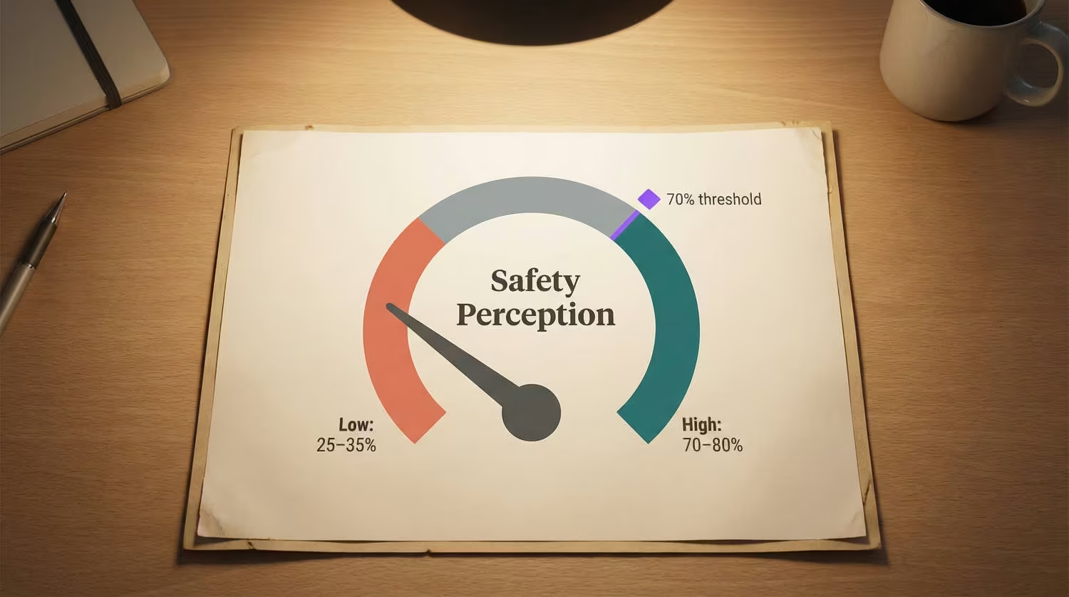
The Comparison Matrix: High vs. Low Safety Perception Organizations
The following framework compares behavioral health settings across six dimensions that correlate with retention outcomes. Each dimension includes an assessment question you can answer with data you already have or can collect within 30 days.
| Dimension | High-Safety Profile | Low-Safety Profile | Assessment Question |
|---|---|---|---|
| Perception measurement | Unit-level safety perception scored separately from engagement, tracked quarterly | Safety questions buried in annual engagement composite | Can you produce unit-level safety perception scores right now? |
| Intent-to-stay connection | Perception scores correlated with intent-to-leave by unit; facilities have recorded drops from 22% to 7% [1] | Safety perception and turnover tracked as separate metrics | Do your perception scores connect to stated retention intent? |
| Reporting culture | Incidents treated as learning opportunities; visible follow-up on every report | Staff perceive that incidents are ignored after reporting [2] | Do reporting staff see documented follow-up? |
| Response visibility | Timestamped response data verified by unit; staff see the system respond in real time | Response times estimated or unknown; staff unsure whether calling for help will produce results | Can you verify response times on your highest-acuity unit with timestamped data? |
| Preparedness | 76%+ of staff feel “very prepared” to respond to incidents [1] | Fewer than 40% feel prepared | What percentage of your staff report feeling very prepared? |
| Financial framing | Safety presented as workforce planning investment with per-point ROI ($289,000 per turnover point [3]) | Safety positioned as a wellness benefit or compliance requirement | Can you translate perception improvement into dollar savings for your CFO? |
The gap between high and low profiles is substantial. Facilities sitting in the middle of this matrix tend to assume they’re performing adequately. The surprise usually comes when they run the unit-level correlation between perception scores and turnover. The CHRO measurement framework covers how to build that correlation, and peer CHROs already tracking this data describe it as the single most useful addition to their workforce dashboards.
Limitations of Each Approach
No measurement approach is perfect. The following table documents the limitations CHROs should account for when evaluating their position on the comparison matrix.
| Approach | What It Captures Well | What It Misses | Key Limitation |
|---|---|---|---|
| Annual engagement survey with safety questions | Facility-level trends over time | Unit-level variation; quarterly perception shifts | 12-month lag means you see problems a year late |
| Quarterly safety-specific pulse surveys | Directional trends at the unit level | Deep root-cause understanding; nuance behind scores | Requires validated item selection; poorly designed pulses produce noisy data |
| Before-and-after perception measurement | Whether specific interventions moved the needle | Long-term sustainability; whether gains hold past 12 months | A 38-point lift assumes a low starting baseline; mid-range facilities should expect smaller gains [1] |
| Intent-to-stay correlation | Leading indicator of unit-level retention risk | Doesn’t capture staff who leave without expressing intent | Requires consistent measurement discipline; one-time snapshots aren’t predictive |
| Incident reports | Documented events with timestamps | 81% of incidents that go unreported [4]; the perception that forms between reports | Stable incident data often masks declining perception |
| Workers’ compensation claims data | Financial impact of safety failures | Prevention value; perception-driven improvements before claims occur | Reductions of 20-50% are documented [1] but depend on baseline severity mix |
Worth noting: the facilities that achieve leader-level outcomes don’t rely on any single approach. They layer quarterly pulses over annual assessments, connect perception to intent-to-stay, and verify response times with timestamped data. Each approach compensates for the blind spots in the others.
The Cost of the Gap
Each percentage point of nursing turnover costs roughly $289,000 annually [3]. For a behavioral health facility running 18% turnover, dropping to 15% represents roughly $867,000 in annual savings. 60% of nurses have changed or left their job due to workplace violence [5], making safety perception one of the most addressable drivers of that cost.
See how one behavioral health provider documented these results across their facilities.
The financial case becomes actionable when you can connect perception scores to intent-to-stay at the unit level. Without that connection, safety investment looks like a cost center. With it, safety investment becomes the workforce planning tool with documented outcomes that changes the CFO conversation.
Assessing Your Facility’s Position
Run through these priority areas before your next leadership review. If three or more reveal gaps, the measurement infrastructure to distinguish between a perception problem and a perception crisis likely isn’t in place.
| Priority Area | What to Evaluate | Why It Matters |
|---|---|---|
| Unit-level measurement | Whether safety perception is scored by unit, not just facility | The facility average masks the units in crisis |
| Perception-retention correlation | Whether perception scores connect to turnover data by unit | Without this, safety investment can’t be justified financially |
| Before-and-after tracking | Whether perception change was measured around your last safety investment | No before-and-after data means no business case for continued funding |
| Intent-to-stay tracking | Whether intent-to-leave is tracked as a function of safety perception | Separates safety-driven attrition from general engagement trends |
| Reporting visibility | Whether staff who report incidents see documented follow-up | Units with the weakest reporting rates often have the lowest perception scores |
The HR brief on safety perception metrics provides the specific data points to bring into each of these evaluation areas, and the full retention data shows what the before-and-after evidence looks like across facility types.
Safety perception is the leading indicator for retention. By the time turnover spikes, the perception problem has been building for months. This staff safety in psychiatric hospitals comparison shows that the gap between current performance and achievable performance is measurable across every dimension in the matrix, and it’s closable.
FACILITY COMPARISON
See Where Your Safety Perception Stands Against Peer Benchmarks
The comparison matrix shows measurable gaps across six retention-relevant dimensions. Find out where your facility falls.
References
- ROAR for Good. Internal data, 2024. Internal data
- National Nurses United. Workplace Violence Report. https://www.nationalnursesunited.org/sites/default/files/nnu/documents/0224_Workplace_Violence_Report.pdf
- NSI Nursing Solutions. 2025 NSI National Health Care Retention & RN Staffing Report. https://www.nsinursingsolutions.com/documents/library/nsi_national_health_care_retention_report.pdf
- AHRQ PSNet. Addressing Workplace Violence and Creating a Safer Workplace. https://psnet.ahrq.gov/perspective/addressing-workplace-violence-and-creating-safer-workplace
- ROAR for Good. An Analysis of Workplace Violence Statistics in Healthcare. https://www.roarforgood.com/blog/an-analysis-of-workplace-violence-statistics-in-healthcare/