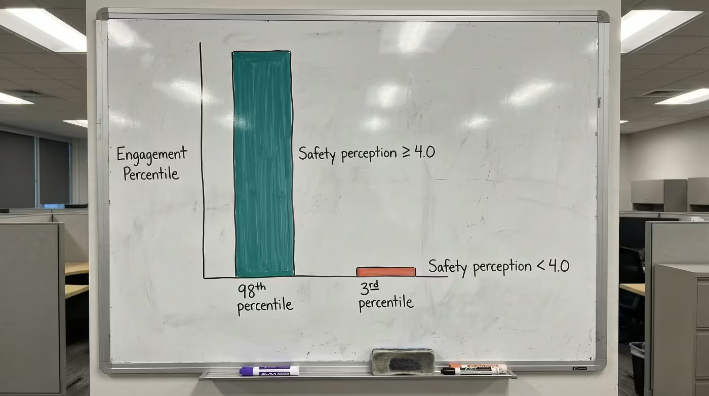
Staff Duress Solution Data: Board-Ready Evidence Brief

Balance scale with incident report outweighed by invisible mass in healthcare office showing underreporting data gap

Key Takeaways

  • Most cost estimates boards review reflect a fraction of actual incidents, meaning the real financial exposure from workplace violence is far larger than anyone in the room assumes.
  • Peer behavioral health organizations have documented 40% assault reductions within six months of deploying structured safety technology.
  • You can build a solid financial model using inputs from your own facility: current workers’ comp claims, annual nursing turnover, and open position count.

Your board wants staff duress solution data. Your CNO has made the safety case. Your CFO wants sourced numbers. But when a skeptical director asks what comparable behavioral health organizations have actually measured, most CEOs can’t produce a consolidated evidence brief.

What Inaction Costs Behavioral Health Organizations

Workplace violence costs U.S. hospitals $18.27 billion annually [1]. That figure includes $13.1 billion in treatment for violent injuries and $584 million in infrastructure repairs.

For behavioral health, the exposure is worse. Psychiatric aides experience a workplace injury rate of 543.6 per 10,000 workers, the highest in the Bureau of Labor Statistics dataset [2].

The number that changes the conversation: 81% of workplace violence incidents go unreported [3]. Your board is making decisions based on the visible portion of the problem. The financial exposure underneath is roughly four times larger than what anyone in the room can document.

When incidents do surface, the penalties stack. OSHA maximum fines for willful violations reach $165,514 per violation in 2025 [4].

Staff Duress Solution Data: Documented Outcomes Across Peer Facilities

Peer behavioral health organizations have documented enough outcomes to move past anecdotes. The strongest results, with methodology context a skeptic can evaluate:

Organization TypeMetricResultTimelineMethodology
National behavioral health providerAssaults against staff40% reduction6 monthsROAR customer data, pre/post measurement [5]
Behavioral health center (BeWell)Workers’ comp claims24% decreasePost-deploymentROAR customer data, pre/post measurement [5]
National behavioral health providerWorkers’ comp claims50% decreasePost-deploymentROAR customer data, pre/post measurement [5]
Hospital intervention units (RCT)Violent incident rates52% lower vs. controls6 monthsPeer-reviewed RCT (non-U.S.; comprehensive program, not technology alone) [6]

A note on methodology: customer outcomes are pre/post measurements at individual facilities. The peer-reviewed finding used a randomized controlled design with a comprehensive intervention program. Concurrent interventions like training or staffing changes may contribute to outcomes at any facility. This transparency matters. A CFO who spots the distinction will trust the compilation more because of it.

Building the Financial Case Without Guesswork

The financial model requires no vendor calculator. Three cost-avoidance categories give your CFO something to stress-test with your own numbers:

  1. Turnover cost avoidance. Replacing one bedside RN costs $61,110 [7]. At one customer facility, staff who said they’d consider leaving due to safety concerns dropped from 22% to 7% [5]. Apply that shift to your own headcount and replacement costs. Each percentage point of nursing turnover change saves or costs the average hospital $289,000 per year [8].
  2. Workers’ comp reduction. Use your facility’s average annual claims count. Apply the 24% to 50% reduction range documented above. Multiply by your average cost per claim.
  3. Vacancy cost avoidance. Industry analysis estimates each vacant behavioral health clinician position generates roughly $30,000 in unbillable appointment costs per quarter [9]. Count your current open positions.

These ranges reflect outcomes at specific peer facilities; your results will depend on your current claims volume, turnover rate, and baseline incident frequency.

The model is yours to adapt. Plug in your numbers, share the inputs with your CFO, and let them challenge the assumptions.

See how one behavioral health provider documented these results across their facilities.

Effort Versus Return in Real Deployments

U.S. hospitals spend $1.4 billion annually on violence prevention training [1]. The question is whether that spend produces measurable outcomes.

ApproachStaff Hours RequiredTimeline to ResultsDocumented Outcome
De-escalation training (150 staff)1,200 to 2,400 hours (estimates vary by program)VariesVaries by program
Technology deployment (duress system)Minimal staff hours; no disruption to patient care reportedUnder 6 months to measurable value [5]40% assault reduction; up to 50% workers’ comp decrease [5]

Behind every data point is a staff member who went home safer. That’s what rapid response time means in practice: the gap between pressing a button and getting help nearly disappears.

These gaps are common. Most organizations start here. Peer organizations that built their case from evidence like this found the board conversation went better than expected.

A behavioral health safety specialist can walk you through how these numbers apply to facilities like yours.

Contact Us

Your Board-Ready Evidence Summary

This summary lifts directly into a board memo or executive briefing.

CategoryKey FindingSourceMethodology Note
Cost of inaction$18.27B annual cost to U.S. hospitals; 81% of incidents unreportedAHA 2025; AHRQIndustry-wide estimates; underreporting inflates true exposure
Peer outcomes40% assault reduction in 6 months; 24% to 50% workers’ comp decreaseROAR customer dataPre/post measurement at customer facilities
Financial model inputs$61,110 per RN replacement; $289,000 per 1% turnover changePlexsum 2025; NSI 2025Published industry benchmarks
Regulatory compliance100% Joint Commission and OSHA inspection pass rate post-deploymentROAR customer data [5]Facilities with automated duress systems

Board members typically ask three questions:

  • Where did these numbers come from? Every figure above includes its source.
  • Could something else explain the improvement? The methodology notes flag where concurrent factors may contribute.
  • What’s the timeline? Peer outcomes were measured within six months.

This evidence brief on staff duress solution data is built to be reused. Save it. Return to it before your next board meeting, your next CFO conversation, your next budget cycle. The data points are sourced, the methodology context is included, and the financial model is yours to adapt.

PEER EVIDENCE

Ready to Build Your Evidence Brief?

See the documented outcomes from behavioral health organizations comparable to yours.

References

  1. American Hospital Association. (2025). New AHA Report Finds Workplace and Community Violence Cost Hospitals More Than $18 Billion. https://www.aha.org/press-releases/2025-06-02-new-aha-report-finds-workplace-and-community-violence-cost-hospitals-more-18-billi
  2. Bureau of Labor Statistics. (2025). Workplace Violence 2021-2022 Fact Sheet. https://www.bls.gov/iif/factsheets/workplace-violence-2021-2022.htm
  3. Agency for Healthcare Research and Quality. Addressing Workplace Violence and Creating a Safer Workplace. https://psnet.ahrq.gov/perspective/addressing-workplace-violence-and-creating-safer-workplace
  4. Safety+Health Magazine. (2025). OSHA and MSHA Civil Penalty Amounts Going Up. https://www.safetyandhealthmagazine.com/articles/26317-osha-and-msha-civil-penalty-amounts-going-up
  5. ROAR for Good. Internal Data, 2024.
  6. National Center for Biotechnology Information. Hospital Violence Prevention Intervention Study. https://pmc.ncbi.nlm.nih.gov/articles/PMC5214512/
  7. Plexsum. (2025). The Real Cost of Nurse Turnover: What Hospitals Need to Know in 2025. https://plexsum.com/2025/04/08/the-real-cost-of-nurse-turnover-what-hospitals-need-to-know-in-2025/
  8. NSI Nursing Solutions. (2025). National Health Care Retention Report. https://www.nsinursingsolutions.com/documents/library/nsi_national_health_care_retention_report.pdf
  9. Continuum Cloud. True Cost of Turnover in Behavioral Health. https://continuumcloud.com/blogs/true-cost-of-turnover-in-behavioral-health-how-hr-leaders-can-reduce-it/

Nurse Duress Data: Board-Ready Evidence Across 3 Cost Categories

CFO examining overflowing incident report file organizer in behavioral health supply closet

Key Takeaways

  • Most behavioral health facilities have never compiled violence-related workers’ comp claims, agency spend, and turnover into one board-ready number, even though the data lives in reports they already produce.
  • Peer behavioral health facilities have documented meaningful workers’ comp reductions and retention improvements after addressing nurse duress, with leading indicators visible within the first quarter.
  • This brief consolidates sourced evidence across three auditable cost categories into a board-ready package your finance committee can verify independently.

Your behavioral health facilities have a workplace violence problem you can describe but can’t yet defend with numbers the board will accept. The connection between nurse duress data and financial outcomes is real. Your CNO sees it. Your CHRO sees it. The board finance committee requires sourced evidence organized by categories they already track. This brief compiles that evidence across three categories: workers’ comp claims, agency spend, and violence-driven turnover.

What Inaction Costs Per Quarter

Behavioral health settings face violence at roughly 14 times the rate of general hospitals [1]. That baseline exposure drives costs across three auditable categories your board already reviews.

Cost CategoryPer-Unit CostYour Internal ReportSource
Workers’ comp (trauma claim)$68,231 averageQuarterly claims summaryNational Safety Council [2]
Agency nurse premium$93.81/hr vs. $55.79/hr staff (68% premium)Monthly staffing reportNSI Nursing Solutions [3]
Violence-driven departures19.2% of nurses left due to violenceHR retention dashboardNational Nurses United [4]

The per-claim number deserves attention. That $68,231 is the average for trauma injuries, and each claim your facility files lands in this tier or higher [2]. Agency costs compound the problem because every nurse who leaves a high-acuity unit gets replaced at nearly double the hourly rate.

Whatever your current incident data shows is a floor. 81% of workplace violence incidents go unreported [5]. Your cost calculations represent a fraction of actual exposure.

Documented Nurse Duress Data From Peer Facilities

The question for any capital request: what have comparable facilities actually documented?

MetricResultSource
Workers’ comp claims24-50% reductionPeer behavioral health facility data [6]
Intent to leave over safetyDropped from 22% to 7%Peer behavioral health facility data [6]
Employee injuries per 1,000 visits50% reduction (3.4 to 1.7)Peer-reviewed research [7]

A board finance committee will ask whether these outcomes are independently verifiable. The workers’ comp reductions are auditable claims data, and your carrier’s loss runs will confirm or contradict the trajectory. The intent-to-leave shift is survey-based; pair it with actual HR turnover data from your system before presenting it as a financial projection. The independent research showing a 50% injury reduction [7] confirms the direction without relying on a single source.

Behind every claims reduction is a nurse who stayed healthy and stayed employed. Those peer organizations started exactly where you are now.

See how one behavioral health provider documented these results across their facilities.

Building the Board-Ready Cost Model

Your board expects a financial model built from data you already have. The CMS Business Case framework [8] calls for six elements:

  • Need statement
  • Measure impact
  • Influencing factors
  • Resources
  • Costs
  • Net benefit

Three internal reports give you the inputs:

  • Quarterly claims summary (claims count x per-claim cost)
  • Monthly staffing report (agency hours x rate differential)
  • HR retention dashboard (turnover rate x $289,000 per point [3])

That $289,000 figure is the conversion factor. NSI reports that each percentage point change in RN turnover costs or saves the average hospital $289,000 per year [3]. Your behavioral health units likely run above the national average.

Want to see how these evidence categories map to your facility's specific financial exposure? A behavioral health safety specialist can walk through it with you.

Contact Us

Timeline From Deployment to Measurable Return

The board will ask when results appear. The honest answer depends on which metric you track.

TimeframeWhat MovesEvidence
30-60 daysStaff preparedness, response timesPeer facility deployment data [6]
60-90 daysIntent to leave, incident trendsPeer facility deployment data [6]
Under 6 monthsMOD score (your workers’ comp insurance multiplier), claims trajectoryPeer facility deployment data [6]
12-24 monthsInsurance premiumsNCCI uses a three-year lookback for experience rating [9]

Leading indicators appear in weeks. Financial metrics shift in quarters. The 90-day proof timeline maps exactly which signals to watch at each checkpoint. Insurance premiums take longer because the NCCI experience rating system looks back three years [9]. Set that expectation with the board before approval.

The Nurse Duress Data Summary You Present

The table below consolidates sourced evidence from this brief. Attach it to your next capital request or board memo.

Evidence CategoryKey Data PointSource
Violence exposure rateRoughly 14x general hospital rateSheps Center / UNC [1]
Per-claim cost (trauma)$68,231 averageNational Safety Council [2]
Agency cost premium68% above staff rateNSI [3]
Violence-driven departures19.2% of nursesNational Nurses United [4]
Per-point turnover cost$289,000/yearNSI [3]
Peer facility claims reduction24-50%Peer facility data [6]
Peer facility intent-to-leave22% to 7%Peer facility data [6]
Underreporting rate81% of incidentsAHRQ PSNet [5]

Your finance team already produces the reports that contain this evidence. This brief compiles it into a single board-ready package. The evidence comes from peer-reviewed research, national workforce surveys, and documented peer facility outcomes across three categories your team tracks monthly. The methodology is transparent. The nurse duress data case is yours to make.

BOARD-READY DATA

Ready to Build Your Facility-Specific Cost Model?

Your claims data, agency spend, and turnover rates tell a story the board needs to see. A behavioral health safety specialist can help you map peer-documented outcomes to your own financial exposure across all three categories.

References

  1. Sheps Center, UNC. Workplace Violence in Healthcare, 2021-2022. https://www.shepscenter.unc.edu/wp-content/uploads/2025/01/Y10.01_Brief-1.pdf
  2. National Safety Council. Workers’ Compensation Costs. https://injuryfacts.nsc.org/work/costs/workers-compensation-costs/
  3. NSI Nursing Solutions. 2025 National Health Care Retention & RN Staffing Report. https://www.nsinursingsolutions.com/documents/library/nsi_national_health_care_retention_report.pdf
  4. National Nurses United. 2024 Workplace Violence Report. https://www.nationalnursesunited.org/sites/default/files/nnu/documents/0224_Workplace_Violence_Report.pdf
  5. AHRQ PSNet. Addressing Workplace Violence and Creating a Safer Workplace. https://psnet.ahrq.gov/perspective/addressing-workplace-violence-and-creating-safer-workplace
  6. ROAR for Good. Internal Deployment Data, 2024.
  7. PMC. Behavioral Response Team Program Outcomes. https://pmc.ncbi.nlm.nih.gov/articles/PMC11745859/
  8. CMS. Business Case Best Practices. https://mmshub.cms.gov/measure-lifecycle/measure-conceptualization/business-case/best-practices
  9. NCCI. Experience Rating ABC. https://www.ncci.com/articles/documents/uw_abc_exp_rating.pdf

Staff Safety in Psychiatric Hospitals Data: Retention

psychiatric hospital safety perception engagement gap — whiteboard two-bar chart showing 98th vs 3rd percentile cliff between high and low safety perception

Key Takeaways

  • This evidence brief compiles the peer-reviewed and recorded data connecting safety perception to retention, financial outcomes, and workforce stability in behavioral health
  • The evidence summary table consolidates every data point a CFO needs to evaluate safety perception as a retention lever
  • A verification checklist at the end shows whether your facility has the measurement infrastructure to build the business case

Exit interviews keep surfacing safety concerns. Your turnover dashboard keeps climbing. This staff safety in psychiatric hospitals data brief connects those two signals with the specific evidence your CFO needs: peer-reviewed correlation data, recorded before-and-after outcomes, and a financial translation that turns perception improvement into dollar savings. For the full framework behind why perception predicts retention, see the complete guide to staff safety in psychiatric hospitals.

The Perception-Retention Correlation

Safety culture predicts turnover intent with a strong negative correlation. Peer-reviewed research recorded a correlation of -0.883 between safety culture perception and nursing turnover intention [1]. Safety culture accounted for about 6.4% of turnover intent independently [1], which is notable given that it competes with compensation, scheduling, management quality, and commute time for the same outcome.

60% of nurses have changed or left their job due to workplace violence [2]. In behavioral health, where turnover exceeds the national nursing average by more than 6 percentage points [3], each departure costs more than the sector average because the replacement pool is smaller.

The engagement connection reinforces this. When safety perception scores reach 4.0 or above on a 5-point scale, engagement ranks at the highest levels nationally. When scores drop below that threshold, engagement collapses [4]. Safety perception drives engagement, and engagement drives retention. That chain is now documented at every link. The CHRO measurement framework covers how to surface this connection in your own data.

Recorded Before-and-After Outcomes

Facilities that established baselines, intervened, and re-measured recorded the following shifts [5]:

MetricBeforeAfterChange
Intent-to-leave due to safety concerns22%7%15-point reduction
“I feel safe at work” sentimentBaselineUp to 38-point liftMaximum recorded increase
Staff satisfaction with safety57%73%16-point gain in 3 months
Staff feeling “very prepared” for incidents38%76%38-point increase
Team members reporting increased confidence~80%

The 38-point lift represents the maximum recorded increase. Facilities with higher starting baselines should expect smaller gains over longer timelines. The 57% to 73% satisfaction shift happened within a single quarter, placing it at the fastest end of recorded timelines.

What these numbers share: every one was captured through before-and-after measurement. That measurement discipline is the step most facilities skip, and it’s the step that turns a wellness initiative into a workforce planning tool with documented outcomes.

Ready to build the evidence portfolio for your next budget conversation?

Contact Us

The Financial Case

CategoryMetricValue
Cost of turnoverPer-RN replacement cost$61,110-$88,000 [3]
Cost of turnoverPer-percentage-point turnover cost$289,000/year [3]
Cost of turnoverBH setting (200 nurses, 22% turnover)~$6.4M annually
Value of interventionIntent-to-leave reduction15 percentage points [5]
Value of interventionWorkers’ comp claims reduction24-50% [5]
Value of interventionTimeline to measurable change3-9 months [6]

For a behavioral health facility running 18% turnover, dropping to 15% represents roughly $867,000 in annual savings. The workers’ comp reductions (24-50%) depend on baseline severity; the higher end came from facilities with the most severe incident rates. The full comparison across organizational models shows how these numbers scale by facility size.

See how one behavioral health provider documented these results across their facilities.

The Evidence Summary

The evidence chain below consolidates what a CFO needs to evaluate safety perception as a retention lever.

ClaimEvidenceSource
Safety perception predicts turnoverCorrelation of -0.883 (p = .006)Peer-reviewed [1]
Perception drives engagementDramatic gap between high and low perception scores on engagementPress Ganey / AHRQ [4]
Perception improvement is measurableUp to 38-point sentiment increaseRecorded deployments [5]
Perception change reduces intent-to-leave22% to 7%Recorded deployments [5]
Each turnover point has financial value$289,000/yearNSI 2025 Report [3]
BH is the highest-ROI settingHighest turnover + highest violence rates in healthcareNSI [3], Sheps Center [7]

Behavioral health’s combination of high turnover and high violence rates makes it the setting where safety perception improvement yields the greatest per-dollar retention return. Even a fraction of the documented shifts, in a setting where each turnover point costs $289,000, changes the math. Peer CHROs building this data into their workforce dashboards describe it as the business case that finally moved the budget conversation.

Evidence Portfolio Checklist

Before your next budget conversation, verify whether you can produce answers to these:

Verification QuestionWhy It Matters
Can you produce a dated baseline for “I feel safe at work” scores across behavioral health units?Without a baseline, no improvement is provable
Do exit interviews specifically ask about safety perception (not just “workplace concerns”)?Vague questions produce vague data
Are you tracking incidents filed versus incidents witnessed?Reported data alone understates the problem (81% unreported [4])
Does workers’ comp data connect to specific units and shifts?Facility-level totals hide the highest-risk areas
Can you show a 3-month and 9-month trendline on safety perception scores?Trendlines prove sustained change, not one-time bumps

The HR brief on safety perception metrics provides the specific data points to bring into each of these verification areas.

The staff safety in psychiatric hospitals data is clear: perception predicts turnover intent, perception improvement produces recorded retention shifts, and each turnover point saved returns $289,000 annually. The evidence exists to transform exit interview patterns into a quantified business case.

EVIDENCE PORTFOLIO

Build the Business Case Your CFO Needs

The peer-reviewed and recorded data connecting safety perception to retention exists. See what it looks like for your facility.

References

  1. PMC. Patient Safety Culture, Resilience, and Turnover Intention Among Nurses. https://pmc.ncbi.nlm.nih.gov/articles/PMC12896111/
  2. National Nurses United. Workplace Violence Report. https://www.nationalnursesunited.org/press/nnu-report-shows-increased-rates-of-workplace-violence-experienced-by-nurses
  3. NSI Nursing Solutions. 2025 National Health Care Retention & RN Staffing Report. https://www.nsinursingsolutions.com/documents/library/nsi_national_health_care_retention_report.pdf
  4. AHRQ PSNet. Ensuring Patient and Workforce Safety. https://psnet.ahrq.gov/perspective/ensuring-patient-and-workforce-safety-culture-healthcare
  5. ROAR for Good. Internal data, 2024. Internal data
  6. Dove Press. Workplace Violence Prevention in Healthcare. https://www.dovepress.com/article/download/80739
  7. Sheps Center. Trends in Workplace Violence, 2025. https://www.shepscenter.unc.edu/wp-content/uploads/2025/01/Y10.01_Brief-1.pdf

WiFi vs. BLE Mesh: Bluetooth Panic Button Performance Data

WiFi router trapped in concrete cube beside free purple bluetooth panic button beacon

Key Takeaways

  • WiFi infrastructure falls far short of the uptime threshold healthcare safety systems require, and the gap translates to dozens of hours per year when staff alerts can’t get through.
  • Documented bluetooth panic button data from WiFi-independent deployments shows the only published performance metrics in this category, filling an evidence gap no competitor has addressed.
  • The consolidated numbers tell a single story: WiFi-independent architecture delivers measurable, verifiable reliability in the exact environments where WiFi-dependent systems fail.

WiFi infrastructure in healthcare runs at roughly 95 to 99 percent availability [1]. That sounds acceptable until you calculate what it means: somewhere between 36 and 87 hours per year when a WiFi-dependent safety system can’t process alerts. For behavioral health facilities where violence rates are the highest in healthcare [2], those hours represent gaps in staff protection that no amount of network tuning closes.

This bluetooth panic button data brief compiles the documented performance metrics, the industry benchmarks that contextualize them, and the evidence gap that defines the competitive landscape.

The Cost of WiFi-Dependent Safety Systems

Healthcare mission-critical systems require at least 99.9 percent availability, which allows roughly 52 minutes of downtime per year [1]. WiFi falls short by orders of magnitude. The gap between what WiFi delivers and what safety systems require is measured in days, not minutes.

The cost goes beyond downtime. Healthcare network upgrades run anywhere from $100,000 to $500,000 depending on facility size and building complexity [3]. That investment improves WiFi coverage. It doesn’t fix the structural problem underneath.

Behavioral health facilities use concrete block walls, metal framing, reinforced doors, and lead-lined barriers [4]. These materials are chosen for patient safety and infection control, not wireless performance. Adding more access points to buildings designed to block wireless signals is an ongoing cost with diminishing returns.

Meanwhile, workplace violence costs U.S. hospitals more than $18 billion annually [5]. When staff press a button during those 36 to 87 hours of WiFi downtime, nothing happens.

Bluetooth Panic Button Data: WiFi-Independent Performance

Documented deployment data confirms 99.9 percent SLA-verified uptime, the only published uptime metric in this technology category [6].

MetricDocumented PerformanceWiFi Benchmark
System uptime99.9% SLA-verified [6]95–99% (36–87 hrs downtime/year) [1]
Incident response93% resolved in under 2 minutes [6]Degrades as signal strength drops
Network dependencyZero; standalone private networkRequires hospital LAN
Clinical network impactNoneAdds traffic and added security risk

These metrics reflect a standalone private network operating independently of hospital WiFi. When individual beacons fail, the mesh routes around them automatically. That eliminates the single point of failure that WiFi-dependent designs carry.

The 93 percent resolution rate holds across all facility zones, including areas with the densest construction materials [6]. The remaining incidents still resolve, just outside the two-minute window, typically in outdoor perimeter zones where responder travel distance is the limiting factor rather than system performance.

No competing vendor publishes comparable performance data. That transparency gap is itself informative.

Coverage Where WiFi Can’t Reach

Violence in healthcare doesn’t stay in patient rooms. The highest-risk locations include:

  • Emergency departments (roughly three in ten active shooter incidents in hospitals) [5]
  • Patient rooms (about one in five) [5]
  • Parking lots (about one in seven, and among the most common locations for violent crimes nationally) [5] [7]

A CTO needs verified coverage in every one of these areas.

Psychiatric units present worse wireless conditions than general hospital environments. Dense construction materials chosen for patient containment block signals that other facility types take for granted. Site surveys in behavioral health buildings routinely reveal dead zones within feet of high-risk areas. These are structural realities of the buildings, not gaps in technology planning.

Documented BLE mesh deployments deliver 100 percent facility coverage verified through site surveys, including parking lots, stairwells, and outdoor areas where WiFi doesn’t reach [6]. Alert-log analytics confirm consistent response times regardless of zone [6].

One qualification: “100% coverage” means verified during the site survey. Facilities that undergo significant construction or layout changes after the survey would need re-verification.

See how one behavioral health provider documented these results across their facilities.

What Happens When the Power Goes Out

Healthcare facilities experience more than seven power events per facility per year in core systems, with nearly five total facility shutdowns annually [8]. When backup generators fail or extreme weather takes down power infrastructure, WiFi-dependent safety systems fail at the same moment staff need them most.

Documented deployment data shows uninterrupted operation during a four-hour power outage, with fully charged devices lasting six to eight hours on battery [6]. Battery-powered beacons require no wiring. The mesh keeps processing alerts independent of facility power and network infrastructure.

One practical note: the six-to-eight-hour window assumes devices started fully charged. Facilities running consecutive shifts without a charging protocol could see shorter runtimes. The architecture holds up under stress, but it still requires basic operational discipline around charging.

If you need documented performance data for your business case, we can walk you through what these numbers look like at your facility.

Contact Us

The Evidence Summary: What the Numbers Prove Together

CategoryMetricValue
UptimeSLA-verified availability99.9% (52 min downtime/year) [6]
CoverageFacility zone verification100%, verified in site surveys [6]
ResponseIncidents resolved under 2 min93% [6]
Battery backupOperation during power outage6–8 hours [6]
Deployment costPer-badge capex$182 [6]
Time to valueFull deploymentUnder 6 months [6]
RegulatoryJoint Commission/OSHA audits100% passed, zero citations [6]

Each row answers a question an executive or a surveyor will ask. Together they prove four things:

  • Uptime that meets the healthcare mission-critical threshold WiFi can’t reach
  • Coverage verified in every zone, including the ones WiFi-dependent systems miss
  • Resilience through power outages that take down WiFi and facility networks
  • Deployment cost and timeline that fit behavioral health budgets

The evidence gap matters as much as the evidence itself. No competing vendor publishes comparable bluetooth panic button data across infrastructure types. Facilities evaluating alternatives are comparing documented performance against vendor projections, not against equivalent published data. That gap is the strongest argument in the business case: you can verify these numbers. Ask any competing vendor to match them.

The bluetooth panic button data compiled here is documented, not claimed. For CTOs building the business case for WiFi-independent safety architecture, these are the numbers that hold up under scrutiny.

PERFORMANCE DATA

The Numbers That Hold Up Under Scrutiny

Documented bluetooth panic button data: 99.9% uptime, 100% verified coverage, and proven operation through power outages. No competing vendor publishes comparable metrics.

References

  1. Bubobot. https://bubobot.com/blog/understanding-website-uptime-benchmarks-sl-as-and-business-impact
  2. Sheps Center UNC. https://www.shepscenter.unc.edu/wp-content/uploads/2025/01/Y10.01_Brief-1.pdf
  3. Turn-Key Technologies. https://www.turn-keytechnologies.com/blog/article/hospital-wireless-network-updates-what-costs-can-you-expect
  4. NCBI. https://pmc.ncbi.nlm.nih.gov/articles/PMC11946332/
  5. AHA / HIPRC. https://www.aha.org/costsofviolence
  6. ROAR for Good – Internal Data, 2024.
  7. LHA Trust Funds. https://lhatrustfunds.com/news/parking-lot-safety
  8. Vertiv / Ponemon Institute. https://www.vertiv.com/490372/globalassets/documents/reports/ponemon/vertiv-ponemon-data-center-downtime-survey-report_321974_0.pdf

Staff Duress Deployment Data: Survey Evidence Guide

Staff duress deployment data underreporting: one nurse files report while four colleagues ignore blank forms

Key Takeaways

  • More than half of behavioral health surveys with violence prevention findings cite training gaps, and over half cite leadership oversight failures, making these the two highest-risk areas for accreditation.
  • Documented outcome data from facilities with safety technology shows measurable response times, incident reduction, and pass rates that satisfy what surveyors evaluate.
  • A CMO evidence portfolio covering response capability, incident trending, training competency, and governance reporting provides the survey-ready documentation that policy binders alone can’t deliver.

About 56% of behavioral health surveys with violence prevention findings cite inadequate training records. Another 55% cite leadership oversight gaps [1]. These aren’t edge cases. They’re the two most common reasons behavioral health facilities run into trouble during accreditation visits. This staff duress deployment data brief compiles the outcome evidence that demonstrates program effectiveness when surveyors come looking for proof.

The Citation Pattern

The data tells a consistent story. The most common citation category involves training records that prove attendance but not competency [1]. Sign-in sheets show who was in the room. Surveyors want evidence that staff retained what they learned and can demonstrate it on the spot.

Leadership oversight gaps follow close behind. Surveyors look for board reporting, leadership rounding observations, and executive participation in program development [1]. When those records are missing or inconsistent, the citation targets leadership accountability rather than frontline performance.

Underneath both patterns sits an underreporting problem that makes the numbers worse. 81% of workplace violence incidents go unreported by healthcare workers who experienced them [2]. Only about a third of nurses say their employer gives them a clear way to report [3]. Behavioral health settings face the highest violence rates in healthcare, with psychiatric facilities seeing roughly 11 times the incident rate of the general workforce [4]. When surveyors interview staff who’ve experienced violence but see no corresponding records, the gap reflects directly on program credibility.

The combination is what creates accreditation risk: high incident environments with low documentation rates and training records that don’t prove competency.

Outcome Evidence That Satisfies Surveyors

Facilities with documented safety technology produce measurable outcomes that map directly to what surveyors evaluate. The data shows consistent patterns across tracked deployments:

Evidence CategoryDocumented OutcomeWhy It Matters
Inspection results100% Joint Commission and OSHA pass rate [5]Direct accreditation evidence from facilities with systematic tracking
Response capability93% of incidents resolved in under 2 minutes [5]Quantified response data replaces anecdotal estimates
Incident reduction39% reduction in patient-staff incidents within 3 months [5]Measurable program effectiveness over time
Staff preparednessStaff feeling “very prepared” increased from 38% to 76% after deployment [5]Training effectiveness with before-and-after data

The practical difference matters. When a surveyor asks how quickly help arrives, pulling a report showing documented response times with historical trending ends the conversation. An estimate invites follow-up questions that get harder with each one.

See how one behavioral health provider documented these results across their facilities.

Behavioral health facilities show 40% reduction in assaults against staff within six months of deployment [5]. That trajectory matters for CMOs building internal business cases: the same data that satisfies surveyors demonstrates ROI to the board.

The Financial Stakes

Accreditation loss can suspend Medicare and Medicaid billing, putting millions in annual revenue at risk for behavioral health systems [6]. OSHA penalties for willful workplace violence violations exceed $165,000 per violation [7]. Beyond penalties, the regulatory exposure includes CMS reviewing compliance with its own standards when Joint Commission accreditation lapses [8].

But the financial case extends past risk avoidance. Each percentage point change in RN turnover costs roughly $289,000 annually [9]. Facilities with documented safety systems report measurable improvement in staff feeling safe at work [5], and that connection between documented safety and retention is the number that resonates with CFOs and boards.

Want to see what documented outcome evidence looks like for your facilities?

Request a Demo

Building Your Evidence Portfolio

CMOs preparing for accreditation should verify they can produce staff duress deployment data across these categories:

  • Response capability: documented response times with trending by unit and shift. Can you pull this for any quarter a surveyor selects?
  • Incident trending: data showing volume, location, shift, and time-of-day patterns formatted for board reporting with quarter-over-quarter comparisons.
  • Training competency: pre-training and post-training assessment scores for all staff, including travelers and agency nurses. Attendance records without competency proof are the single most cited gap [1].
  • Investigation follow-through: complete trails from incident report through root cause analysis, corrective action, and resolution for every documented event. Surveyors pull 5-10 random incidents and review each trail [10].
  • Governance reporting: quarterly safety data presented to leadership with evidence of discussion and follow-up action.

Behind the 81% underreporting rate are staff who’ve experienced violence and concluded that documenting it changes nothing. Systematic documentation changes that calculation by making every incident visible and every response measurable. For CMOs, the staff duress deployment data compiled here provides the evidence that surveyors evaluate and that policy binders alone can’t deliver.

SURVEY EVIDENCE

Build Your Evidence Portfolio Before Surveyors Arrive

Facilities with documented safety systems produce the outcome evidence surveyors evaluate. See what that looks like for your organization.

References

  1. National Library of Medicine. “Behavioral Health Survey Findings.” https://pmc.ncbi.nlm.nih.gov/articles/PMC8816837/
  2. Agency for Healthcare Research and Quality (AHRQ) PSNet. “Addressing Workplace Violence and Creating a Safer Workplace.” 2023. https://psnet.ahrq.gov/perspective/addressing-workplace-violence-and-creating-safer-workplace
  3. National Nurses United. “High and Rising Rates of Workplace Violence.” February 2024. https://www.nationalnursesunited.org/sites/default/files/nnu/documents/0224_Workplace_Violence_Report.pdf
  4. Sheps Center at University of North Carolina. “Trends in Workplace Violence for Health Care Occupations.” January 2025. https://www.shepscenter.unc.edu/wp-content/uploads/2025/01/Y10.01_Brief-1.pdf
  5. ROAR for Good. Internal Data, 2024.
  6. Facilio. “Healthcare CMMS for Joint Commission Compliance in 2025.” https://facilio.ae/blog/healthcare-joint-commission-compliance/
  7. Safety + Health Magazine. “OSHA and MSHA Civil Penalty Amounts Going Up.” January 2025. https://www.safetyandhealthmagazine.com/articles/26317-osha-and-msha-civil-penalty-amounts-going-up
  8. CMS. “Workplace Violence in Hospitals Memorandum.” https://www.cms.gov/files/document/qso-23-04-hospitals.pdf
  9. NSI Nursing Solutions, Inc. “2025 National Health Care Retention & RN Staffing Report.” March 2025. https://www.nsinursingsolutions.com/documents/library/nsi_national_health_care_retention_report.pdf
  10. The Joint Commission. “Workplace Violence Prevention Program.” https://www.jointcommission.org/en-us/knowledge-library/workforce-safety-and-well-being-resource-center/workplace-violence-prevention/workplace-violence-prevention-program