Staff Duress Solution Comparison: 5 Dimensions That Matter

Three rulers with mismatched markings on desk illustrating violence prevention approach comparison

Key Takeaways

  • Most behavioral health organizations compare staff duress solutions using criteria chosen by vendors, leading to decisions shaped by the last sales presentation rather than organizational priorities
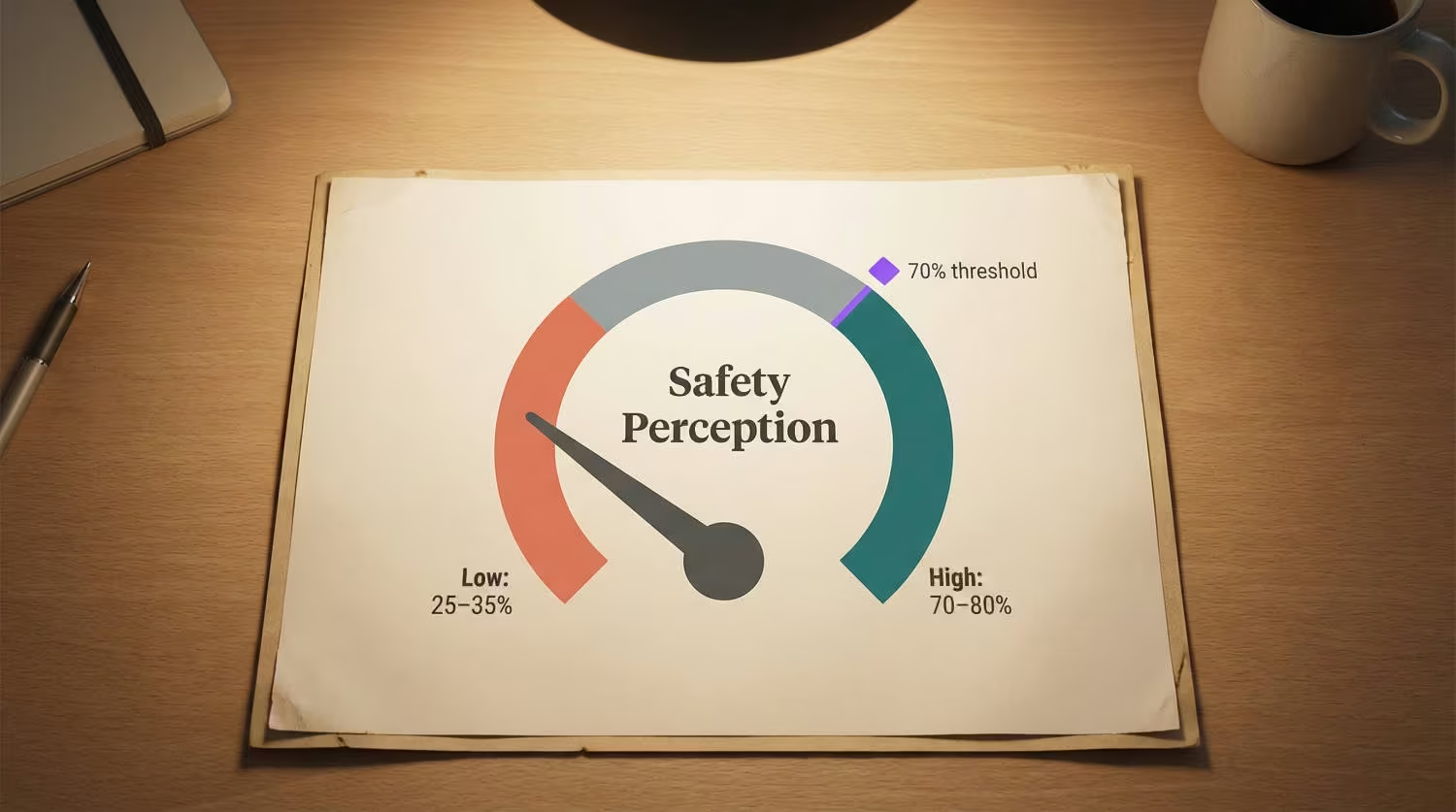
  • Peer organizations that make faster, stronger choices score solutions against fixed dimensions: network independence, deployment burden, behavioral health fit, outcome documentation, and vendor stability
  • A scored comparison matrix gives your board consistent evaluation criteria they can revisit for every future vendor conversation, turning a one-time purchase into a governance standard

Every vendor selling a staff duress solution comparison will show you the dimensions where they win. When each vendor controls the criteria, your evaluation team ends up comparing three different arguments instead of three solutions against one standard. Peer behavioral health CEOs who avoid costly replacements take a different approach: they fix the comparison dimensions first, then score every option against them.

How Peer CEOs Actually Compare Solutions

Most behavioral health organizations lack a consistent method for evaluating duress solutions. The evaluation team collects demos, stacks feature lists, and picks the option that performed best in the last presentation. That process produces a recommendation shaped by recency, not by what your organization actually needs.

One emergency department installed a complex duress alarm system that failed to reduce violence [1]. Staff refused to wear it because of bulky design, poor training, and unreliable security response. The organization evaluated the technology’s capabilities without asking the question that determined success: would frontline staff actually use it?

Behavioral health settings make this gap more consequential. Psychiatric and substance abuse hospitals face the highest violence rates in healthcare [2]. A duress system that staff refuse to wear creates active liability, signaling a safety program exists while leaving staff unprotected.

Vendor presentations do surface useful evaluation dimensions. The risk comes when those vendor-selected dimensions become the only scoring criteria, crowding out what matters most in your environment.

DimensionWhat It Measures
Network ArchitectureWhether the system operates independently of facility WiFi and maintains accuracy during outages
Deployment BurdenTime, technology staff dependency, and care disruption required to install and activate the system
Behavioral Health SpecializationCoverage of BH-specific high-risk areas and wearable design suited to clinical settings
Outcome DocumentationAutomated incident capture and compliance-ready reporting across regulatory categories
Vendor StabilityCustomer retention, behavioral health market commitment, and multi-year track record

Staff Duress Solution Comparison: Scoring Against Peer Benchmarks

Joint Commission workplace violence prevention standards (effective January 2025) require documented evidence across four categories: staff awareness, response capability, reporting effectiveness, and continuous incident trending [3]. Your comparison matrix should score each solution against these requirements.

Important boundary condition: This framework applies to dedicated duress solutions. Organizations evaluating duress as a feature within broader RTLS platforms should add an integration burden dimension to account for the additional complexity those platforms introduce.

DimensionLeading (Score: 3)Adequate (Score: 2)Gap (Score: 1)
Network ArchitectureIndependent infrastructure (dedicated wireless mesh); room-level accuracy; functions during outagesFacility WiFi with backup plan; zone-level accuracyWiFi-dependent; no outage resilience; hallway-level accuracy only
Deployment BurdenDays to deploy; no wiring; zero technology staff dependency; no care disruptionWeeks to deploy; moderate technology coordination; some workflow adjustmentMonths to deploy; extensive wiring; significant care disruption
BH SpecializationDesigned for behavioral health; covers hallways, patient rooms, nurse stations; discreet wearableHealthcare solution with BH adaptations; partial coverage of high-risk areasEnterprise or general solution; coverage gaps in BH-specific locations
Outcome DocumentationAutomatic incident capture; Joint Commission-ready reports; trending across all four JC categoriesPartial automation; manual report generation; trending in some categoriesManual reporting only; no automated compliance documentation
Vendor Stability95%+ customer retention; behavioral health is primary market; multi-year track recordRetention data available; BH is growing segment; stable leadershipRetention data unavailable; BH is secondary market; recent leadership changes

How to read the scores: A solution scoring 13-15 meets peer benchmarks across all dimensions. A solution scoring 9-12 has addressable gaps. Below 9 signals a fundamental mismatch with behavioral health requirements.

Outcome documentation deserves extra weight. An estimated 81% of workplace violence incidents in healthcare go unreported [4]. Solutions that capture incidents automatically close this documentation gap. Facilities with automated duress systems have passed 100% of Joint Commission and OSHA inspections with zero citations [5].

Where Your Current Approach Likely Falls Short

Most organizations discover gaps only after a surveyor visit or a critical incident. These five questions surface them earlier.

  1. Network independence: During your last power or network outage, did your duress system keep working? If the answer is unknown, that gap is confirmed.
  2. Deployment burden: How long did your last safety technology deployment take? Did it require technology staff to reroute other projects?
  3. Behavioral health fit: Was your duress solution designed for behavioral health, or adapted from another setting? Hallways account for 42% of behavioral health duress alerts [6]. Your comparison should verify coverage matches these patterns.
  4. Outcome documentation: Can you produce a 90-day incident trend report for a surveyor within 30 minutes? If the answer requires calling three departments, the documentation dimension is a gap.
  5. Vendor stability: What is your vendor’s customer retention rate? How many behavioral health facilities do they serve?

Staff rate the importance of rapid response at 4.7 out of 5, but satisfaction with current processes averages only 3.5 [7]. That gap shows where frontline trust begins to erode.

Nearly two in five healthcare workers have considered leaving their positions over safety concerns [8]. At one facility with an automated duress system, the share of staff considering leaving over safety dropped from 22% to 7% after deployment [5].

Two or more gaps in your honest answers likely place your current approach below peer benchmarks. These gaps are common, and most organizations start here.

See how one behavioral health provider documented these results across their facilities.

Prioritizing Gaps for Board Discussion

When a board director asks how you evaluated your duress solution, the answer needs to sound like governance, not a vendor recommendation.

GapPriority Rationale
Network IndependenceHighest failure risk; a system that goes dark during a crisis leaves staff with false confidence and no protection
Outcome DocumentationRegulatory requirement; industry estimates suggest Joint Commission accreditation loss risks Medicare and Medicaid funding worth $2 to $5 million annually [9]
Behavioral Health SpecializationMission alignment; a solution designed for your environment performs differently than one adapted for it
Deployment BurdenOrganizational capacity; a solution your team can’t absorb won’t get adopted
Vendor StabilityLong-term viability; 99%+ customer retention signals that organizations stay after deployment [5]

Present this framework to your board as a standing evaluation tool. Use it to score your current vendor, benchmark new options, and document why you chose the solution you chose. The framework becomes the standard your organization uses every time a safety technology decision reaches the board.

Your Evidence Assessment Checklist

Before presenting your staff duress solution comparison to the board, verify you can answer each of these:

  • You scored every solution against the same fixed dimensions, not against each vendor’s preferred criteria
  • Your scoring matrix includes documented peer benchmarks, not just vendor claims
  • You matched each dimension to a Joint Commission evidence category
  • You identified your organization’s highest-priority gap and can explain why it ranks first
  • You have at least one peer reference from a comparable behavioral health facility
  • Your comparison document is formatted for board governance, not for an operational meeting

The staff duress solution comparison framework gives behavioral health CEOs something most lack: evaluation criteria that belong to the organization. When the next board question comes, the answer is a scored matrix built on peer benchmarks.

SAFETY EVALUATION

Ready to Score Your Safety Program?

Use peer benchmarks to evaluate your current duress solution against the dimensions that matter in behavioral health.

References

  1. Morphet, J., et al. (2023). Implementation of a personal duress alarm system in emergency departments. Journal of Advanced Nursing. https://pubmed.ncbi.nlm.nih.gov/37150562/
  2. Sheps Center for Health Services Research. (2025). Workplace Violence in Healthcare Brief. https://www.shepscenter.unc.edu/wp-content/uploads/2025/01/Y10.01_Brief-1.pdf
  3. Joint Commission. (2024). Workplace Violence Prevention Standards, effective January 2025. https://www.jointcommission.org/en-us/knowledge-library/newsletters/joint-commission-online/17-jul-24
  4. Agency for Healthcare Research and Quality. Addressing Workplace Violence and Creating a Safer Workplace. https://psnet.ahrq.gov/perspective/addressing-workplace-violence-and-creating-safer-workplace
  5. ROAR for Good. (2024). Internal deployment and customer outcome data.
  6. Campus Safety Magazine. (2025). Healthcare Duress Alert Trends and RTLS Technology Comparison. https://www.campussafetymagazine.com/insights/5-healthcare-duress-alert-trends-from-2025/177012/
  7. ROAR for Good / UHS. (2024). Internal staff survey data.
  8. Verkada. (2024). Healthcare Safety Research. https://www.verkada.com/blog/healthcare-safety-research/
  9. Facilio. (2024). Healthcare Joint Commission Compliance. https://facilio.ae/blog/healthcare-joint-commission-compliance/

Nurse Duress Comparison: 5 Benchmarks for BH Costs

Behavioral health workers comp filing cabinets comparing turnover cost gaps in administrative office

Key Takeaways

  • Behavioral health organizations differ by hundreds of thousands of dollars on five financial dimensions tied to violence and nurse duress, yet most CFOs have never benchmarked these gaps against peers
  • Agency spend, vacancy duration, workers’ comp, turnover rate, and incident documentation each carry a measurable dollar value you can score using reports you already produce monthly
  • The dimension where you trail peers the furthest likely costs more than the other four gaps combined, making it the clear starting point for your next budget conversation

Behavioral health facilities can vary by more than $900,000 a year on five financial dimensions tied to violence and nurse duress. Most CFOs have no structured way to see where their organization falls. This nurse duress comparison framework lets you score your position, compare against peers, and find which gap costs you the most every month it stays open. The full financial picture of nurse duress and turnover frames why these five dimensions matter at the board level.

Five Dimensions That Separate Leaders from the Field

General hospital RN turnover sits at 16.4%. Behavioral health reaches 30-40% [1]. That gap is why general healthcare benchmarks mislead behavioral health CFOs. Your cost exposure lives on a different scale, and violence exposure connects all five dimensions below. A facility-specific turnover cost calculation gives you the per-departure number behind the turnover dimension.

DimensionWhat It TracksWhy It Costs You Money
Turnover rateAnnual RN departures as % of staffEach percentage point costs ~$289,000/year [1]
Agency spend ratioAgency/travel staff as % of nursing labor budgetAgency nurses cost $93.81/hr vs $55.79 for staff [1]
Vacancy durationDays from resignation to filled positionEach open day carries coverage costs and lost capacity
Workers’ comp / MOD scoreExperience modification rate and claims frequencyA 0.25-point MOD difference can translate to ~$150,000-$225,000 in annual premiums [2]
Incident documentation rate% of known incidents with formal documentationLow capture rates hide patterns that drive the other four dimensions

Where Most Organizations Actually Score

DimensionMedianTop QuartileAnnual Gap (100-bed facility)
Turnover rate30-40%Below 20%$1.8M-$2.4M in replacement costs [1]
Agency spend ratio14-16% of labor budget6-8%$480,000-$960,000
Vacancy duration65-75 days30-35 days$180,000-$320,000
Workers’ comp / MODAbove 1.0Below 0.85~$150,000-$225,000 in premiums
Incident documentation40-50% capture rateAbove 80%Enables savings across all other dimensions

Most behavioral health organizations fall at or below median on at least two dimensions. If your incident documentation sits below 50%, your data on the other four dimensions is likely understating the problem [3]. Peer CFOs tracking three connected indicators are finding the same pattern.

What Top Performers Do Differently

Top-quartile organizations treat these five dimensions as connected, not as separate budget lines. When one improves, several improve together. Three patterns show up consistently:

  • They invest in safety infrastructure that produces returns across multiple dimensions. One provider documented workers’ comp reductions of 24-50%, with MOD scores improving nearly 50% and time to value under six months [4].
  • They pair staffing levels with violence prevention. Higher staffing paired with safety measures correlates with 15-25% reductions in violence incidents [5].
  • They have a formal retention strategy. Only 59.3% of hospitals do [1]. The organizations reaching top quartile on these dimensions almost always do. See how one provider achieved these results.

Score Your Organization Right Now

All five inputs come from reports you already produce monthly.

  1. Turnover rate: BH RN turnover over the past 12 months?
  • Below 20% = Top Quartile / 20-30% = Above Median / 30-40% = Median / Above 40% = Below Median
  1. Agency spend ratio: % of nursing labor budget going to agency or travel staff?
  • Below 8% = Top Quartile / 8-14% = Above Median / 14-16% = Median / Above 16% = Below Median
  1. Vacancy duration: Average days from resignation to filled RN position?
  • Below 35 days = Top Quartile / 35-65 = Above Median / 65-75 = Median / Above 75 = Below Median
  1. Workers’ comp / MOD score: Current experience modification rate?
  • Below 0.85 = Top Quartile / 0.85-1.0 = Above Median / 1.0-1.15 = Median / Above 1.15 = Below Median
  1. Incident documentation rate: % of known incidents with formal documentation?
  • Above 80% = Top Quartile / 60-80% = Above Median / 40-60% = Median / Below 40% = Below Median

If you scored at or below median on two or more dimensions, you’re in the majority. These gaps are common. The value of this assessment is knowing which gap costs you the most. A one-pager that aligns your C-suite turns your widest gap into a funded next step.

Close Your Highest-Cost Gap First

Start with the dimension where your score trails the furthest. That single gap likely accounts for more annual cost exposure than the other four combined.

  • If incident documentation is your widest gap: Improving from 40% to 80% capture typically takes 3-6 months, requires minimal capital, and enables pattern identification that drives reductions across the other four dimensions [6].
  • If workers’ comp or agency spend is your widest gap: Safety infrastructure investment produces faster returns on those dimensions. Facilities deploying safety systems have documented workers’ comp reductions of 24-50% [4].

One important boundary: no single investment moves all five dimensions to top quartile. The organizations that improved the most addressed their highest-cost gap first, proved the return, then expanded. The 90-day proof timeline shows how leading indicators confirm the return before lagging metrics catch up.

Your scores reveal which specific gap costs your organization the most relative to peers, and where a targeted investment produces the fastest financial return.

COST OF INACTION

Where Does Your Highest-Cost Gap Fall?

Your scores across five dimensions point to a specific starting place. We can help you map the financial exposure and build a case for closing the widest gap first.

References

  1. NSI Nursing Solutions, Inc. – 2025 National Health Care Retention & RN Staffing Report. https://www.nsinursingsolutions.com/documents/library/nsi_national_health_care_retention_report.pdf
  2. Helpside – Workers’ Comp Experience Modification. https://www.helpside.com/workers-comp-experience-modification/
  3. PMC – Workplace Violence in Psychiatric Settings. https://pmc.ncbi.nlm.nih.gov/articles/PMC6345477/
  4. ROAR for Good – Internal Data, 2024. Internal data
  5. PMC – Staffing, Violence, and Financial Outcomes. https://pmc.ncbi.nlm.nih.gov/articles/PMC11976120/
  6. Simplifyance – Incident Reporting in Behavioral Healthcare. https://simplifyance.com/blog/incident-reporting-in-behavioral-healthcare/

Staff Safety in Psychiatric Hospitals Comparison | 2026

psychiatric hospital safety perception self-assessment — printed five-row checklist with three empty checkboxes and purple pen across unchecked rows

Key Takeaways

  • The comparison matrix across six dimensions reveals where your facility sits between high-safety and low-safety profiles, with measurable gaps on every retention-relevant metric
  • Facilities in the middle of the spectrum tend to assume they’re performing adequately until they run the unit-level correlation between perception scores and turnover
  • A limitations table and evidence assessment checklist give you the framework to evaluate where your measurement infrastructure stands today

Units with the highest turnover are the same units where staff rate safety lowest. Exit interviews confirm it. The connection between safety perception and retention shows up in every workforce dashboard you pull, but most facilities lack a structured way to assess where they stand against peers. This staff safety in psychiatric hospitals comparison provides that framework across six measurable dimensions, along with the limitations of each approach and an assessment checklist for your next leadership review. For the full research behind the perception-retention connection, see the complete guide to staff safety in psychiatric hospitals.

The Comparison Matrix: High vs. Low Safety Perception Organizations

The following framework compares behavioral health settings across six dimensions that correlate with retention outcomes. Each dimension includes an assessment question you can answer with data you already have or can collect within 30 days.

DimensionHigh-Safety ProfileLow-Safety ProfileAssessment Question
Perception measurementUnit-level safety perception scored separately from engagement, tracked quarterlySafety questions buried in annual engagement compositeCan you produce unit-level safety perception scores right now?
Intent-to-stay connectionPerception scores correlated with intent-to-leave by unit; facilities have recorded drops from 22% to 7% [1]Safety perception and turnover tracked as separate metricsDo your perception scores connect to stated retention intent?
Reporting cultureIncidents treated as learning opportunities; visible follow-up on every reportStaff perceive that incidents are ignored after reporting [2]Do reporting staff see documented follow-up?
Response visibilityTimestamped response data verified by unit; staff see the system respond in real timeResponse times estimated or unknown; staff unsure whether calling for help will produce resultsCan you verify response times on your highest-acuity unit with timestamped data?
Preparedness76%+ of staff feel “very prepared” to respond to incidents [1]Fewer than 40% feel preparedWhat percentage of your staff report feeling very prepared?
Financial framingSafety presented as workforce planning investment with per-point ROI ($289,000 per turnover point [3])Safety positioned as a wellness benefit or compliance requirementCan you translate perception improvement into dollar savings for your CFO?

The gap between high and low profiles is substantial. Facilities sitting in the middle of this matrix tend to assume they’re performing adequately. The surprise usually comes when they run the unit-level correlation between perception scores and turnover. The CHRO measurement framework covers how to build that correlation, and peer CHROs already tracking this data describe it as the single most useful addition to their workforce dashboards.

Limitations of Each Approach

No measurement approach is perfect. The following table documents the limitations CHROs should account for when evaluating their position on the comparison matrix.

ApproachWhat It Captures WellWhat It MissesKey Limitation
Annual engagement survey with safety questionsFacility-level trends over timeUnit-level variation; quarterly perception shifts12-month lag means you see problems a year late
Quarterly safety-specific pulse surveysDirectional trends at the unit levelDeep root-cause understanding; nuance behind scoresRequires validated item selection; poorly designed pulses produce noisy data
Before-and-after perception measurementWhether specific interventions moved the needleLong-term sustainability; whether gains hold past 12 monthsA 38-point lift assumes a low starting baseline; mid-range facilities should expect smaller gains [1]
Intent-to-stay correlationLeading indicator of unit-level retention riskDoesn’t capture staff who leave without expressing intentRequires consistent measurement discipline; one-time snapshots aren’t predictive
Incident reportsDocumented events with timestamps81% of incidents that go unreported [4]; the perception that forms between reportsStable incident data often masks declining perception
Workers’ compensation claims dataFinancial impact of safety failuresPrevention value; perception-driven improvements before claims occurReductions of 20-50% are documented [1] but depend on baseline severity mix

Worth noting: the facilities that achieve leader-level outcomes don’t rely on any single approach. They layer quarterly pulses over annual assessments, connect perception to intent-to-stay, and verify response times with timestamped data. Each approach compensates for the blind spots in the others.

The Cost of the Gap

Each percentage point of nursing turnover costs roughly $289,000 annually [3]. For a behavioral health facility running 18% turnover, dropping to 15% represents roughly $867,000 in annual savings. 60% of nurses have changed or left their job due to workplace violence [5], making safety perception one of the most addressable drivers of that cost.

See how one behavioral health provider documented these results across their facilities.

The financial case becomes actionable when you can connect perception scores to intent-to-stay at the unit level. Without that connection, safety investment looks like a cost center. With it, safety investment becomes the workforce planning tool with documented outcomes that changes the CFO conversation.

Assessing Your Facility’s Position

Run through these priority areas before your next leadership review. If three or more reveal gaps, the measurement infrastructure to distinguish between a perception problem and a perception crisis likely isn’t in place.

Priority AreaWhat to EvaluateWhy It Matters
Unit-level measurementWhether safety perception is scored by unit, not just facilityThe facility average masks the units in crisis
Perception-retention correlationWhether perception scores connect to turnover data by unitWithout this, safety investment can’t be justified financially
Before-and-after trackingWhether perception change was measured around your last safety investmentNo before-and-after data means no business case for continued funding
Intent-to-stay trackingWhether intent-to-leave is tracked as a function of safety perceptionSeparates safety-driven attrition from general engagement trends
Reporting visibilityWhether staff who report incidents see documented follow-upUnits with the weakest reporting rates often have the lowest perception scores

The HR brief on safety perception metrics provides the specific data points to bring into each of these evaluation areas, and the full retention data shows what the before-and-after evidence looks like across facility types.

Safety perception is the leading indicator for retention. By the time turnover spikes, the perception problem has been building for months. This staff safety in psychiatric hospitals comparison shows that the gap between current performance and achievable performance is measurable across every dimension in the matrix, and it’s closable.

FACILITY COMPARISON

See Where Your Safety Perception Stands Against Peer Benchmarks

The comparison matrix shows measurable gaps across six retention-relevant dimensions. Find out where your facility falls.

References

  1. ROAR for Good. Internal data, 2024. Internal data
  2. National Nurses United. Workplace Violence Report. https://www.nationalnursesunited.org/sites/default/files/nnu/documents/0224_Workplace_Violence_Report.pdf
  3. NSI Nursing Solutions. 2025 NSI National Health Care Retention & RN Staffing Report. https://www.nsinursingsolutions.com/documents/library/nsi_national_health_care_retention_report.pdf
  4. AHRQ PSNet. Addressing Workplace Violence and Creating a Safer Workplace. https://psnet.ahrq.gov/perspective/addressing-workplace-violence-and-creating-safer-workplace
  5. ROAR for Good. An Analysis of Workplace Violence Statistics in Healthcare. https://www.roarforgood.com/blog/an-analysis-of-workplace-violence-statistics-in-healthcare/

3 Architectures Compared: Bluetooth Panic Button Systems

Bluetooth panic button comparison stairwell with diminishing WiFi bars painted on each landing

Key Takeaways

  • The building materials that define behavioral health facilities block WiFi signals, creating dead zones in the exact locations where staff face the greatest risk.
  • A bluetooth panic button comparison across WiFi-dependent, hardwired, and standalone BLE mesh architectures shows that each carries a structural limitation that determines where it works and where it fails.
  • The architecture that fits your facility depends on your building construction, your coverage needs, and the technology resources you can realistically commit.

The dead zones in your facility tell the real story. The stairwell where WiFi drops. The parking lot where coverage ends at the building wall. The older wing where concrete and steel block signals that work fine in the administrative corridor. These are where staff get hurt, and where a bluetooth panic button comparison actually matters.

In behavioral health settings, violence rates are the highest in healthcare [1]. Those incidents cluster in the spots where coverage is weakest. Comparing WiFi-dependent, hardwired, and standalone BLE mesh architectures against those realities reveals which systems work in your environment and which don’t.

Why the Architecture Choice Determines Coverage

Behavioral health facilities operate in buildings designed to contain patients, not transmit wireless signals. Concrete block walls, metal framing, reinforced doors, and lead-lined barriers all weaken WiFi significantly [2]. The effect compounds through multiple barriers: a locked unit behind two corridor walls and a fire door blocks enough signal to turn a covered hallway into a dead zone.

These are permanent features of the buildings, not problems a network upgrade solves. The architecture you choose for your safety system either works within those constraints or fails against them.

Joint Commission standards effective July 2024 require behavioral health facilities to prove safety system coverage throughout all areas where staff work, including outdoor areas and parking facilities [3]. The architecture determines whether your system meets that standard or leaves documented gaps.

Bluetooth Panic Button Comparison: Three Architectures

The following table maps each architecture against the dimensions CTOs evaluate during selection.

DimensionWiFi-DependentHardwired (IR)Standalone BLE Mesh
CoverageLimited to WiFi footprint; dead zones in stairwells, parking, outdoorsBuilding interior only; no outdoor coverageFull facility including parking lots, stairwells, outdoor areas [4]
ReliabilityFails during network outagesInterference-proof within covered areasSelf-healing mesh; 99.9% SLA-verified uptime [4]
Infrastructure dependencyRequires robust WiFi; adds load to clinical networkRequires cable runs to every roomIndependent network; no hospital LAN connection
Deployment timelineWeeks if WiFi adequate; months if upgrades neededSeveral months to over a year [5]Days to weeks [6]
Failure modeNetwork outage = system outageCable damage = room outageNode failure triggers automatic reroute
Published reliability dataNone documentedNone documented99.9% uptime [4]

Two patterns stand out. WiFi-dependent and hardwired systems each carry a structural limitation that can’t be engineered away: WiFi fails during outages, and hardwired can’t extend outdoors.

The 99.9% uptime figure comes from a single vendor’s deployment data [4]. No independent third-party audit has been published, and competitors haven’t documented equivalent metrics. That asymmetry makes a true side-by-side reliability comparison difficult. It also raises a fair question: why hasn’t the rest of the category published anything?

Performance Under Stress

The real test of any architecture is what happens when conditions deteriorate.

Stress ScenarioWiFi-DependentHardwiredStandalone BLE Mesh
Facility-wide power outageFails unless access points are on backup generators (many aren’t)Operates on backup power if availableBattery backup with six to eight hours of operation [4]
Network outage (ISP, switching, or infrastructure failure)Complete system failureUnaffected (no network dependency)Unaffected (standalone private network)
Single node/device failureConnected devices lose coverage until reconnectionRoom loses coverage until cable repairMesh routes around failed node automatically
Dense construction interferenceSignal degrades proportionally; dead zones expandNot affected by wireless interferenceMesh relays through multiple paths [7]

Healthcare facilities experience more than seven power events per year in core systems, with nearly five total facility shutdowns annually [8]. These are annual events, not edge cases.

During a documented four-hour power outage, one BLE mesh deployment operated continuously with up to eight hours of battery reserve while WiFi went dark [4]. That’s the difference between an architecture that depends on facility infrastructure and one that doesn’t.

What Each Architecture Demands From Your Technology Team

Behavioral health technology budgets run 15 to 25 percent below comparable acute care hospitals on a per-bed basis [9]. The architecture you select has to fit the resources you actually have.

FactorWiFi-DependentHardwiredStandalone BLE Mesh
Infrastructure requiredWiFi upgrades if coverage inadequateCable runs, wall penetration, conduitBattery-powered beacons; adhesive mounting
Typical timeline8–16 weeks if WiFi adequateSeveral months to over a yearDays to weeks
Technology team burdenNetwork configuration; ongoing WiFi managementMinimal post-installMinimal; self-monitoring
Retrofit cost premium25–40% above new construction [10]25–40% above new construction [10]None
Ongoing maintenanceWiFi network maintenanceCable inspection; rewiring for changesBattery replacement every two to three years
Per-badge costVaries by vendorSignificant infrastructure investment$182 per badge [4]

For facilities facing Joint Commission survey timelines or responding to incident trends, deployment speed determines how long the coverage gap stays open. Days-to-weeks timelines assume the vendor walks the facility first, not just ships hardware.

See how one behavioral health provider documented these results across their facilities.

Which Architecture Fits Your Facility

The right answer depends on your building, not your preferences. This framework maps the assessment.

DimensionAssessment QuestionsArchitecture Implications
Building constructionWhat decade were your buildings constructed? Do you have concrete or steel construction?Older buildings with dense materials favor standalone wireless over WiFi dependency
Network maturityWhat percentage of your facility has reliable WiFi? Do dead zones exist in stairwells, basements, parking?Significant dead zones favor standalone wireless or hardwired
Coverage needsDo staff work in parking lots, outdoor areas, transition zones? Do you need coverage during power outages?Outdoor needs eliminate hardwired; outage needs eliminate WiFi-dependent
Technology resourcesWhat’s your team’s capacity for new projects? Can you support months-long installation?Resource constraints favor infrastructure-light deployment
Budget structureDo you have capital budget for infrastructure, or need a lower-cost deployment?Hardwired requires significant capital; standalone wireless minimizes infrastructure investment

Many facilities discover their infrastructure constraints eliminate one or two options before technical evaluation begins. If your buildings are older than 30 years, you need outdoor coverage, and your technology team is stretched, the comparison narrows quickly.

The bluetooth panic button comparison that matters is the one measured against your walls, your dead zones, and the locations where your staff actually work. The stairwell where WiFi drops and the parking lot where coverage ends at the building wall are the evaluation criteria, not problems to solve later.

ARCHITECTURE COMPARISON

Which Architecture Fits Your Facility?

Compare WiFi-dependent, hardwired, and standalone BLE mesh against your building, your dead zones, and your technology resources.

References

  1. Sheps Center UNC. https://www.shepscenter.unc.edu/wp-content/uploads/2025/01/Y10.01_Brief-1.pdf
  2. Wilson Connectivity. https://www.wilsonconnectivity.com/blog/3-ways-to-improve-cell-signal-in-metal-and-concrete-buildings
  3. Joint Commission. https://www.jointcommission.org/en-us/standards
  4. ROAR for Good – Internal Data, 2024.
  5. Verkada. https://info.verkada.com/alarms/wired-vs-wireless-alarm-systems/
  6. Link Labs. https://www.link-labs.com/blog/the-truth-about-bluetooth-low-energy-range-for-asset-tracking
  7. NCBI. https://pmc.ncbi.nlm.nih.gov/articles/PMC9965677/
  8. Vertiv / Ponemon Institute. https://www.vertiv.com/490372/globalassets/documents/reports/ponemon/vertiv-ponemon-data-center-downtime-survey-report_321974_0.pdf
  9. JMIR Publications. https://www.jmir.org/2025/1/e70856
  10. The Network Installers. https://thenetworkinstallers.com/blog/small-business-network-setup-cost/

Staff Duress Deployment Comparison: Evidence Types

Staff duress deployment comparison - incident form fading to show 81% unreported violence

Key Takeaways

  • Documentation-only approaches have structural limitations that create gaps surveyors are trained to identify, regardless of how thorough the policies are.
  • Technology-generated evidence addresses those gaps by producing timestamped, continuous records that match what surveyors specifically request.
  • A comparison matrix mapping documentation vs. technology evidence across six surveyor criteria helps CMOs assess where their current approach falls short.

Every behavioral health CMO faces the same question before an accreditation visit: does your evidence show that your violence prevention program works, or does it show that the program exists? The distinction matters because surveyors evaluate implementation through documented outcomes, not policy binders. This staff duress deployment comparison examines what each evidence type actually provides and where the gaps live.

Documentation Evidence: What It Shows and Where It Falls Short

Documentation-based approaches establish that a program exists. Policies are written, training is scheduled, incident forms are available. For surveyors, that’s the starting point, not the finish line.

The core limitation is structural: manual records depend on staff to document incidents during or after crisis moments. 81% of workplace violence incidents go unreported by healthcare workers who experienced them [1]. Only about a third of nurses say their employer gives them a clear way to report [2]. When staff focused on de-escalation don’t stop to log timestamps, records capture what people remember afterward, not what actually happened.

That gap compounds across every evidence area surveyors assess:

Evidence AreaWhat Documentation ProvidesWhere It Falls Short
Response capabilityAnecdotal estimates reconstructed after incidentsNo timestamped data showing how fast help actually arrived
Incident trackingReports filed by staff who chose to documentMisses the majority of incidents that go unreported
Staff readinessSign-in sheets proving training attendanceNo evidence that staff retained or can demonstrate what they learned
Investigation follow-throughInitial reports with varying levels of detailFollow-up trails that go cold after the first filing
Continuous monitoringPeriodic audits and spot checksNo proof the system was operational between checks

The limitations aren’t about effort. Security directors and CNOs working with manual systems aren’t doing it wrong. The system itself can’t capture what it depends on humans to record during the moments they’re least able to do so.

Technology Evidence: What Automated Systems Produce

Technology-generated evidence addresses the structural gap by capturing data as incidents happen rather than relying on post-incident documentation. The practical difference shows up in three areas surveyors specifically evaluate:

Timestamped response data. When a surveyor asks how quickly help arrives, facilities with automated systems pull documented response times with historical trending. Facilities with documented safety systems show 93% of incidents resolved in under 2 minutes [3]. That’s a different conversation than “we respond quickly.”

Continuous monitoring proof. Surveyors request 90-day trending data as a minimum for analysis [4]. Automated systems generate this continuously, analyzed by unit and shift. Manual compilation of the same data after a survey is announced creates gaps in detail and consistency that surveyors notice.

Coverage verification. Surveyors walk facilities including stairwells, parking structures, and utility areas [4]. They check whether staff can summon help from every location. Automated systems document coverage across the full facility including outdoor areas. Manual approaches rely on assumed coverage that hasn’t been verified since the last walkthrough.

Facilities with documented safety technology have passed every Joint Commission and OSHA inspection in tracked deployments [3]. The evidence surveyors request already exists in the system. There’s no compilation step.

Technology doesn’t solve everything. When surveyors interview your night shift and hear that staff don’t activate the system because they believe nothing will change, your documented response times don’t matter. The technology produces records. The culture determines whether those records reflect reality.

The Comparison

This matrix maps documentation and technology evidence against the specific criteria surveyors use during accreditation visits.

Surveyor CriterionDocumentation EvidenceTechnology EvidenceThe Question to Ask
Response time capabilityEstimated from incident reports, reconstructed after the factTimestamped from alert initiation through responder arrivalCan you produce response timestamps within 30 minutes of a surveyor request?
Coverage verificationSelf-reported coverage maps from periodic walkthroughsDocumented coverage across all areas including stairwells and outdoor spacesAre there areas where staff can’t summon help?
How many incidents your system capturesManual reporting dependent on staff willingness and awarenessAutomated capture with location, timestamp, and response dataWhat percentage of incidents actually reach your system?
Continuous monitoring proofPeriodic audits and spot checks with no continuous verificationSystem availability records showing consistent operation over 90+ daysCan you prove your safety system was operational every day for the past quarter?
Trending data availabilityCompiled after survey announcement, may lack unit-level detailRolling 90-day data analyzed by unit, shift, and time periodDo you have 90 days of trending data ready to produce today?
Staff readiness evidenceTraining attendance records with annual sign-offsStaff preparedness metrics showing measurable improvement over time [3]Can your staff demonstrate competency, or just prove they attended?

The pattern across facilities: documentation evidence establishes that a program exists. Technology evidence proves it works. Surveyors can tell the difference within minutes of reviewing your records.

See how one behavioral health provider documented these results across their facilities.

Your Evidence Assessment

Before your next survey window, assess where your current evidence falls on the comparison matrix:

  • Response time test. Request your own 90-day response data. Can your team produce it in under 30 minutes? If it requires manual compilation from multiple systems, you’re in the documentation column.
  • Coverage walkthrough. Walk your stairwells, parking structures, and outdoor areas. Can staff activate duress from every location, or are there dead zones you’ve been assuming don’t exist?
  • Incident capture reality check. Compare your incident logs to what your night-shift nurses would describe in a confidential surveyor interview. If those numbers don’t align, your records aren’t capturing reality.
  • Trending data readiness. Do you have 90 days of incident data analyzed by unit, shift, and time period ready to produce today? Not after a week of compilation. Today.
  • Staff competency verification. Pull three staff from different shifts this week. Ask them to describe the response protocol in their own words. Note who hesitates.

The staff duress deployment comparison between documentation and technology evidence comes down to one question: can you show a surveyor that your program produces outcomes, or only that it exists? For CMOs preparing for accreditation, the evidence portfolio you build determines which answer your organization gives.

EVIDENCE COMPARISON

See What Technology Evidence Looks Like at Your Facility

Behavioral health facilities with documented safety systems produce the evidence surveyors request on demand. See how documentation and technology evidence compare for your organization.

References

  1. Agency for Healthcare Research and Quality (AHRQ) PSNet. “Addressing Workplace Violence and Creating a Safer Workplace.” 2023. https://psnet.ahrq.gov/perspective/addressing-workplace-violence-and-creating-safer-workplace
  2. National Nurses United. “High and Rising Rates of Workplace Violence.” February 2024. https://www.nationalnursesunited.org/sites/default/files/nnu/documents/0224_Workplace_Violence_Report.pdf
  3. ROAR for Good. Internal Data, 2024.
  4. The Joint Commission. “Workplace Violence Prevention Program.” https://www.jointcommission.org/en-us/knowledge-library/workforce-safety-and-well-being-resource-center/workplace-violence-prevention/workplace-violence-prevention-program